Data Mining (137 page)
Authors: Mehmed Kantardzic
Presenting information visually, in an environment that encourages the exploration of linked events, leads to deeper insights and more results that can be acted upon. Over the past decade, research on information visualization has focused on developing specific visualization techniques. An essential task for the next period is to integrate these techniques into a larger system that supports work with information in an interactive way, through the three basic components:
foraging the data
,
thinking about data
, and
acting on data
.
The vision of a visual data-mining system stems from the following principles: simplicity, visibility, user autonomy, reliability, reusability, availability, and security. A visual data-mining system must be syntactically simple to be useful. Simple does not mean trivial or non-powerful. Simple to learn means use of intuitive and friendly input mechanisms as well as instinctive and easy-to-interpret output knowledge. Simple to apply means an effective discourse between humans and information. Simple to retrieve or recall means a customized data structure that facilitates fast and reliable searches. Simple to execute means a minimum number of steps needed to achieve the results. In short, simple means the smallest, functionally sufficient system possible.
A genuinely visual data-mining system must not impose knowledge on its users, but instead guide them through the mining process to draw conclusions. Users should study the visual abstractions and gain insight instead of accepting an automated decision. A key capability in visual analysis, called visibility, is the ability to focus on particular regions of interest. There are two aspects of visibility: excluding and restoring data. The exclude process eliminates the unwanted data items from the display so that only the selected set is visible. The restore process brings all data back, making them visible again.
A reliable data-mining system must provide for estimated error or accuracy of the projected information in each step of the mining process. This error information can compensate for the deficiency that an imprecise analysis of data visualization can cause. A reusable, visual, data-mining system must be adaptable to a variety of environments to reduce the customization effort, provide assured performance, and improve system portability. A practical, visual, data-mining system must be generally and widely available. The quest for new knowledge or deeper insights into existing knowledge cannot be planned. It requires that the knowledge received from one domain adapt to another domain through physical means or electronic connections. A complete, visual, data-mining system must include security measures to protect the data, the newly discovered knowledge, and the user’s identity because of various social issues.
Through data visualization we want to understand or get an overview of the whole or a part of the n-dimensional data, analyzing also some specific cases. Visualization of multidimensional data helps decision makers to
1.
slice information into multiple dimensions and present information at various levels of granularity,
2.
view trends and develop historical tracers to show operations over time,
3.
produce pointers to synergies across multiple dimensions,
4.
provide exception analysis and identify isolated (needle in the haystack) opportunities,
5.
monitor adversarial capabilities and developments,
6.
create indicators of duplicative efforts,
7.
conduct What-If Analysis and Cross-Analysis of variables in a data set.
Visualization tools transform raw experimental or simulated data into a form suitable for human understanding. Representations can take on many different forms, depending on the nature of the original data and the information that is to be extracted. However, the visualization process that should be supported by modern, visualization-software tools can generally be subdivided into three main stages: data preprocessing, visualization mapping, and rendering. Through these three steps the tool has to answer the questions: What should be shown in a plot? How should one work with individual plots? How should multiple plots be organized?
Data preprocessing involves such diverse operations as interpolating irregular data, filtering and smoothing raw data, and deriving functions for measured or simulated quantities. Visualization mapping is the most crucial stage of the process, involving design and adequate representation of the filtered data, which efficiently conveys the relevant and meaningful information. Finally, the representation is often rendered to communicate information to the human user.
Data visualization is essential for understanding the concept of multidimensional spaces. It allows the user to explore the data in different ways and at different levels of abstraction to find the right level of details. Therefore, techniques are most useful if they are highly interactive, permit direct manipulation, and include a rapid response time. The analyst must be able to navigate the data, change its grain (resolution), and alter its representation (symbols, colors, etc.).
Broadly speaking, the problems addressed by current information-visualization tools and requirements for a new generation fall into the following classes:
1.
Presentation Graphics.
These generally consist of bars, pies, and line charts that are easily populated with static data and drop into printed reports or presentations. The next generation of presentation graphics enriches the static displays with a 3-D or projected n-dimensional information landscape. The user can then navigate through the landscape and animate it to display time-oriented information.
2.
Visual Interfaces for Information Access.
They are focused on enabling users to navigate through complex information spaces to locate and retrieve information. Supported user tasks involve searching, backtracking, and history logging. User-interface techniques attempt to preserve user-context and support smooth transitions between locations.
3.
Full Visual Discovery and Analysis.
These systems combine the insights communicated by presentation graphics with an ability to probe, drill down, filter, and manipulate the display to answer the “why” question as well as the “what” question. The difference between answering a “what” and a “why” question involves an interactive operation. Therefore, in addition to the visualization technique, effective data exploration requires using some
interaction
and
distortion
techniques. The
interaction techniques
let the user directly interact with the visualization. Examples of interaction techniques include interactive mapping, projection, filtering, zooming, and interactive linking and brushing. These techniques allow dynamic changes in the visualizations according to the exploration objectives, but they also make it possible to relate and combine multiple, independent visualizations. Note that connecting multiple visualizations by linking and brushing, for example, provides more information than considering the component visualizations independently. The
distortion techniques
help in the interactive exploration process by providing a means for focusing while preserving an overview of the data. Distortion techniques show portions of the data with a high level of detail while other parts are shown with a much lower level of detail.
Three tasks are fundamental to data exploration with these new visualization tools:
1.
Finding Gestalt.
Local and global linearities and nonlinearities, discontinuities, clusters, outliers, unusual groups, and so on are examples of gestalt features that can be of interest. Focusing through individual views is the basic requirement to obtain a qualitative exploration of data using visualization. Focusing determines what gestalt of the data is seen. The meaning of focusing depends very much on the type of visualization technique chosen.
2.
Posing Queries.
This is a natural task after the initial gestalt features have been found, and the user requires query identification and characterization technique. Queries can concern individual cases as well as subsets of cases. The goal is essentially to find intelligible parts of the data. In graphical data analysis it is natural to pose queries graphically. For example, familiar brushing techniques such as coloring or otherwise highlighting a subset of data means issuing a query about this subset. It is desirable that the view where the query is posed and the view that present the response are linked. Ideally, responses to queries should be instantaneous.
3.
Making Comparisons.
Two types of comparisons are frequently made in practice. The first one is a comparison of variables or projections and the second one is a comparison of subsets of data. In the first case, one compares views “from different angles”; in the second, comparison is based on views “of different slices” of the data. In either case, it is likely that a large number of plots are generated, and therefore it is a challenge to organize the plots in such a way that meaningful comparisons are possible.
Visualization has been used routinely in data mining as a presentation tool to generate initial views, navigate data with complicated structures, and convey the results of an analysis. Generally, the analytical methods themselves do not involve visualization. The loosely coupled relationships between visualization and analytical data-mining techniques represent the majority of today’s state-of-the-art in visual data mining. The process-sandwich strategy, which interlaces analytical processes with graphical visualization, penalizes both procedures with the other’s deficiencies and limitations. For example, because an analytical process cannot analyze multimedia data, we have to give up the strength of visualization to study movies and music in a visual data-mining environment. A stronger strategy lies in tightly coupling the visualization and analytical processes into one data-mining tool. Letting human visualization participate in the decision making in analytical processes remains a major challenge. Certain mathematical steps within an analytical procedure may be substituted by human decisions based on visualization to allow the same procedure to analyze a broader scope of information. Visualization supports humans in dealing with decisions that can no longer be automated.
For example, visualization techniques can be used for efficient process of “visual clustering.” The algorithm is based on finding a set of projections P = [P
1
, P
2
, … ,P
k
] useful for separating the initial data into clusters. Each projection represents the histogram information of the point density in the projected space. The most important information about a projection is whether it contains well-separated clusters. Note that well-separated clusters in one projection could result from more than one cluster in the original space. Figure
15.10
shows an illustration of these projections. You can see that the axes’ parallel projections do not preserve well the information necessary for clustering. Additional projections A and B, in Figure
15.10
, define three clusters in the initial data set.
Figure 15.10.
An example of the need for general projections, which are not parallel to axes, to improve clustering process.
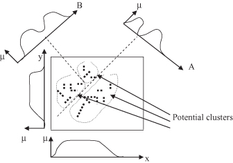
Visual techniques that preserve some characteristics of the data set can be invaluable for obtaining good separators in a clustering process. In contrast to dimension-reduction approaches such as PCAs, this visual approach does not require that a single projection preserve all clusters. In the projections, some clusters may overlap and therefore not be distinguishable, such as projection A in Figure
15.10
. The algorithm only needs projections that separate the data set into at least two subsets without dividing any clusters. The subsets may then be refined using other projections and possibly partitioned further based on separators in other projections. Based on the visual representation of the projections, it is possible to find clusters with unexpected characteristics (shapes, dependencies) that would be very difficult or impossible to find by tuning the parameter settings of automatic-clustering algorithms.
In general, model visualization and exploratory data analysis (EDA) are data-mining tasks in which visualization techniques have played a major role. Model visualization is the process of using visual techniques to make the discovered knowledge understandable and interpretable by humans. Techniques range from simple scatter plots and histograms to sophisticated multidimensional visualizations and animations. These visualization techniques are being used not only to convey mining results more understandable to end users, but also to help them understand how the algorithm works. EDA, on the other hand, is the interactive exploration of usually graphical representations of a data set without heavy dependence on preconceived assumptions and models, thus attempting to identify interesting and previously unknown patterns. Visual data-exploration techniques are designed to take advantage of the powerful visual capabilities of human beings. They can support users in formulating hypotheses about the data that may be useful in further stages of the mining process.