Against the Gods: The Remarkable Story of Risk (29 page)
Read Against the Gods: The Remarkable Story of Risk Online
Authors: Peter L. Bernstein
Quantity matters, as Jacob Bernoulli had discovered. This particular version of his insight-the discovery that averages of averages miraculously reduce the dispersion around the grand average-is known as the central limit theorem. This theorem was first set forth by Laplace in 1809, in a work he had completed and published just before he came upon Gauss's Theoria Motus in 1810.
Averages of averages reveal something even more interesting. We began the experiment I have just described with a die with, as usual, six faces, each of which had an equal chance of coming up when we threw it. The distribution then was flat, bearing no likeness at all to a normal
distribution. As the computer threw the die over and over and over,
accumulating a growing number of samples, we gleaned more and
more information about the die's characteristics.
Very few of the averages of six throws came out near one or six; many of them fell between two and three or between four and five. This structure is precisely what Cardano worked out for his gambling friends, some 250 years ago, as he groped his way toward the laws of chance. Many throws of a single die will average out at 3.5. Therefore, many throws of two dice will average out at double 3.5, or.7.0. As Cardano demonstrated, the numbers on either side of 7 will appear with uniformly diminishing frequency as we move away from 7 to the limits of 2 and 12.

On occasion, the normal distribution provides even more important information than just a measure of the reliability of samples. A normal distribution is most unlikely, although not impossible, when the observations are dependent upon one another-that is, when the probability of one event is determined by a preceding event. The observations
will fail to distribute themselves symmetrically around the mean.
In such cases, we can profitably reason backwards. If independence
is the necessary condition for a normal distribution, we can assume that
evidence that distributes itself into a bell curve comes from observations
that are independent of one another. Now we can begin to ask some
interesting questions.
How closely do changes in the prices of stocks resemble a normal
distribution? Some authorities on market behavior insist that stock
prices follow a random walk-that they resemble the aimless and unplanned lurches of a drunk trying to grab hold of a lamppost. They
believe that stock prices have no more memory than a roulette wheel
or a pair of dice, and that each observation is independent of the preceding observation. Today's price move will be whatever it is going to
be, regardless of what happened a minute ago, yesterday, the day
before, or the day before that.
The best way to determine whether changes in stock prices are in
fact independent is to find out whether they fall into a normal distribution. Impressive evidence exists to support the case that changes in
stock prices are normally distributed. That should come as no surprise.
In capital markets as fluid and as competitive as ours, where each
investor is trying to outsmart all the others, new information is rapidly
reflected in the price of stocks. If General Motors posts disappointing
earnings or if Merck announces a major new drug, stock prices do not
stand still while investors contemplate the news. No investor can afford
to wait for others to act first. So they tend to act in a pack, immediately
moving the price of General Motors or Merck to a level that reflects
this new information. But new information arrives in random fashion.
Consequently, stock prices move in unpredictable ways.
Interesting evidence in support of this view was reported during the
1950s by Harry Roberts, a professor at the University of Chicago.14
Roberts drew random numbers by computer from a series that had the
same average and the same standard deviation as price changes in the
stock market. He then drew a chart showing the sequential changes of
those random numbers. The results produced patterns that were identical to those that stock-market analysts depend on when they are trying to predict where the market is headed. The real price movements and the computer-generated random numbers were indistinguishable from each other. Perhaps it is true that stock prices have no memory.
Although the charts differ from one another, they have two features in common. First, as J.P. Morgan is reputed to have said, "The market will fluctuate." The stock market is a volatile place, where a lot can happen in either direction, upward or downward. Second, more observations fall to the right of zero than to the left: the stock market has gone up, on the average, more than it has gone down.
The normal distribution provides a more rigorous test of the random-walk hypothesis. But one qualification is important. Even if the random walk is a valid description of reality in the stock market-even if changes in stock prices fall into a perfect normal distribution-the mean will be something different from zero. The upward bias should come as no surprise. The wealth of owners of common stocks has risen over the long run as the economy and the revenues and profits of corporations have grown. Since more stock-price movements have been up than down, the average change in stock prices should work out to more than zero.
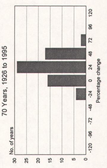
In fact, the average increase in stock prices (excluding dividend income) was 7.7% a year. The standard deviation was 19.3%; if the future will resemble the past, this means that two-thirds of the time stock prices in any one year are likely to move within a range of +27.0% and -12.1%. Although only 2.5% of the years-one out of forty-are likely to result in price changes greater than +46.4%, there is some comfort in finding that only 2.5% of the years will produce bear markets worse than -31.6%.
Stock prices went up in 47 of the 70 years in this particular sample of history, or in two out of every three years. That still leaves stocks falling in 23 of those years; and in 10 of those 23 years, or nearly half, prices plum meted by more than one standard deviation-by more than 12.1%.
Indeed, losses in those 22 bad years averaged -15.2%.


U O
d O
.~ o
b N ,"1
a M
~ 0 d
d~ d
H O
E.pN
O
v Q
U aw
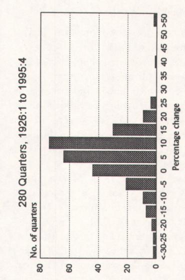
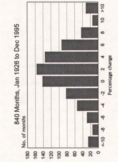
Note that the three charts have different scales. The number of observations, shown on the vertical scales, will obviously differ from one another-in any given time span, there are more months than quarters and
more quarters than years. The horizontal scales, which measure the range
of outcomes, also differ, because stock prices move over a wider span in a
year than in a quarter and over a wider span in a quarter than during a
month. Each number on the horizontal scale measures price changes between the number to the left and that number.
Let us look first at the 840 monthly changes. The mean monthly
change was +0.6%. If we deduct 0.6% from each of the observations in
order to correct for the natural upward bias of the stock market over time,
the average change becomes +0.00000000000000002%, with 50.6% of
the months plus and 49.4% of the months minus. The first quartile observation, 204 below the mid-point, was -2.78%; the third quartile observation, 204 above the mid-point, was +2.91. The symmetry of a normal
distribution appears to be almost flawless.
The random character of the monthly changes is also revealed by the
small number of runs-of months in which the stock market moved in
the same direction as in the preceding month. A movement in the same
direction for two months at a time occurred only half the time; runs as
long as five months occurred just 9% of the time.
The chart of monthly changes does have a remarkable resemblance to
a normal curve. But note the small number of large changes at the edges
of the chart. A normal curve would not have those untidy bulges.
Now look at the chart of 280 quarterly observations. This chart also
resembles a normal curve. Nevertheless, the dispersion is wide and, once
again, those nasty outliers pop up at the extremes. The 1930s had two
quarters in which stock prices fell by more than a third-and two quarters in which stock prices rose by nearly 90%! Life has become more
peaceful since those woolly days. The quarterly extremes since the end of
the Second World War have been in the range of +25% and -25%.
The average quarterly change is +2.0%, but the standard deviation of
12.1% tells us that +2.0% is hardly typical of what we can expect from
quarter to quarter. Forty-five percent of the quarters were less than the
average of 2.0%, while 55% were above the quarterly average.
The chart of 70 annual observations is the neatest of the three, but the
scaling on the horizontal axis of the chart, which is four times the size of
the scaling on the quarterly chart, bunches up a lot of large changes.
The differences in scales are not just a technical convenience to make
the different time periods comparable to one another on these three
charts. The scales tell an important story. An investor who bought and
held a portfolio of stocks for 70 years would have come out just fine. An
investor who had expected to make a 2% gain each and every threemonth period would have been a fool. (Note that I am using the past
tense here; we have no assurance that the past record of the stock market
will define its future.)