Read Are Lobsters Ambidextrous? Online
Authors: David Feldman
Are Lobsters Ambidextrous? (11 page)
Submitted by a caller on the Ray Briem Show, KABC-AM, Los Angeles, California
.

Why
do all the Christmas tree lights burn out when one burns out?
Many a Yuletide has been ruined by the blight of premature Christmas light burnout. So for those who have experienced the trauma of having one burnt-out bulb turning your rainbow of illumination into a cavelike darkness, we have one word of advice for you. Upgrade.
If you experience this problem, your Christmas lights are
series
-wired. In series wiring, each bulb acts like a fuse; if one bulb burns out, the circuit is broken. Some sets have a shunt wire that allows the electricity to pass into the next socket if one bulb burns out, but no series-wired set will work if a bulb is removed from its socket. If your set does not have a functioning shunt wire, all you need to do is locate the missing bulb and replace it in order to close the circuit.
E. H. Scott, of J. Hofert Co., a leading supplier of Christmas trees and decorations, told
Imponderables
that many consumers are confused about how to replace bulbs in series-connected
sets. To find the appropriate bulb, you merely divide the voltage standard (120 volts) by the number of bulbs in the set. If you have a set of 20 lights, you would need a six-volt bulb.
Of course, most families keep Christmas lights originally bought during the Stone Age. Most contemporary Christmas light sets have forsaken series wiring for
parallel
wiring. In this configuration, each bulb burns independently, so that 120 volts are directed to each bulb. The current will flow even if one or more bulbs burn out.
Why did manufacturers use series wiring when parallel wiring was so much more convenient? Hy Greenblatt, representative of the Manufacturers of Illuminating Products, gave us the answer we expected: Parallel wiring is harder to manufacture and considerably more expensive to produce.
Submitted by O.J.J.R. Jennings of Henderson, Nevada. Thanks also to Gregg Gariepy of Muskego, Wisconsin
.
Why
are Yellow Freight System trucks painted orange?
Consistency is the refuge of small minds. Let Yellow Cab Companies all over North America paint their fleets yellow. Trucking giant Yellow Freight System has a more highly evolved imagination.
We got the answer to this Imponderable from Mark J. Spencer, a friendly man with an unlikely job—art curator for Yellow Freight. Spencer is also, as he puts it, “the unofficial archivist of the unofficial archives and thus the unofficial historian” of his company.
Yellow Freight was founded by A. J. Harrell, who ran a taxi service, the Yellow Cab Company of Oklahoma City, in the early 1920s. A.J. started the Yellow Cab Transit Co., a bus service, in 1924, and, more important for our purposes, opened a truck ter
minal in Oklahoma City. Starting with two trucks, what was then known as the Yellow Transit Company, and later Yellow Transit Freight Lines, gobbled up several other companies and became the Yellow Freight System, now one of the three largest freight companies in the United States, with more than 600 terminals and 30,000 employees.
So why did Harrell, who named all of his companies “Yellow,” paint his trucks orange? The evidence indicates that at the very beginning of his freight company, the trucks were not painted any particular color. But Harrell was obsessed with safety, and in the late 1920s or early 1930s, he commissioned the E. I. Dupont Company to determine precisely which shade of color was most visible from the farthest distance. Dupont’s answer: the “swamp holly orange” color you see on all of the tractors of Yellow Freight System.
Faithful readers of
Imponderables
already know that the amber and red shades found on traffic stoplights were selected for the same reason. Yellow Freight’s orange looks like a blend of those two stoplight colors.
Submitted by Paola Sica of Lawrence, Kansas. Thanks also to Bethany Franko of Spring Valley, Ohio; and Jared Martin of Kokomo, Indiana
.
Why
has the orange-colored coffee pot become the symbol for decaffeinated coffee in restaurants?
Obviously, it behooves the customer and restaurateur to have easily identifiable coffee pots on hand, for no waiter or customer can discriminate visually between “regular” and decaffeinated coffee. But the orange rim on restaurant coffee pots is no accident—it is the color associated with Sanka brand decaffeinated coffee, the first and best-selling decaffeinated coffee in North America.
The developer of Sanka coffee, European coffee magnate
Ludwig Roselius, realized the commercial potential of a coffee that didn’t produce nervousness, sleeplessness, and indigestion in caffeine-sensitive coffee drinkers, but his chemists could not devise a process to remove more than half the caffeine while retaining the richness of ordinary coffee.
Supposedly, when a shipment of coffee was traveling between South America and Europe, a storm flooded the coffee with sea water. Although the coffee was ruined for commercial purposes, Roselius’s researchers discovered that the salt water had naturally leached the caffeine out of the coffee but kept the taste intact. Roselius soon marketed a 97 percent caffeine-free product under several different brand names throughout Europe and called the product Sanka (a contraction of
sans caffeine
—“without caffeine”) in France.
When Roselius brought Sanka to the United States in the 1920s, the product was introduced in restaurants in New York City, and packaged Sanka was sold over the counter for home consumption. (Only later, when customer incredulity that the taste of a decaffeinated coffee could be palatable waned, was Sanka sold in grocery stores.) Institutional sales of Sanka have represented a substantial part of the brand’s sales ever since. When General Foods bought the company from Roselius in 1932, it not only advertised to home consumers but aggressively marketed Sanka to restaurants, institutional food services, and offices.
General Food’s Sanka food service division developed the orange pots you see in restaurants and in the coffee room in your office. Subliminally, General Foods hopes, you will equate orange with decaf. This identification is important enough to General Foods that, according to Nan Redmond, director of corporate affairs, the integrity of the color has been assured by trademarking the “Sanka Orange.”
In many cases, Sanka/General Foods provides both the coffee maker and orange pots for free to institutions that buy Sanka brand coffee, ensuring that most of the time when we pick up a cup of Sanka brand outside our homes, the drink has been poured from a “Sanka orange” coffee pot. Although General
Foods wishes that every drop of decaffeinated coffee served in restaurants were Sanka brand, the company can’t keep establishments from serving other brands in orange-rimmed pots. If you see a green-colored pot, it means that Folger Decaf has invaded Sanka territory.
Submitted by K. David Steidley of Short Hills, New Jersey. Thanks also to Craig Kirkland of Greenville, North Carolina, and April Williams of Richton Park, Illinois
.
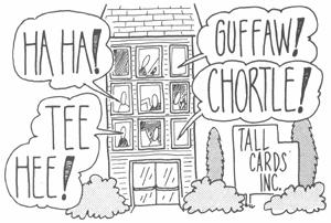
Why
are “contemporary” or slightly risqué greeting cards invariably long and narrow in shape?
This size is known in the greeting card trade as a “studio” card because their earliest merchandisers were Greenwich Village artists who worked out of their studios. Studio cards emerged just after the end of World War II, created by returning veterans, and could be found in any greeting card section by the 1950s. The long, narrow configuration of the studio card attracted attention on the retail shelf; it differed drastically from the boxy, conventionally sized card. To this day, when we see a group of long, narrow greeting cards in a shop, we assume that they are “funny” or “contemporary.”
Although no one seems to know the identity of the inventor of the studio card, chances are he or she was attracted to the size more by financial considerations than marketing ones. Product could be cut from conventional card stock with only one fold. Perhaps even more importantly, the studio card fit snugly into
standard number 10 envelopes, which meant that the artists could obtain readily available envelopes inexpensively. Michael DeMent, product spokesperson for Hallmark, told
Imponderables
that many early artists sold studio cards to retail accounts without envelopes. With lower costs, artists could pass the savings on to their retail accounts, and consumers didn’t mind—they simply placed the card in one of their own number 10 envelopes at home.
You can no longer assume that all funny cards are studio size. Hallmark has a division called Shoebox Greetings, which it facetiously calls “a tiny little division of Hallmark,” which is like a guerrilla operation within the conservative giant. Although Shoebox cards are always humorous, their conventional size does not betray their offbeat attitude.
In a business totally dominated by Hallmark in the 1950s, artists saw a niche: greeting cards, heretofore, were almost exclusively a women’s product. Even today, according to DeMent, about 90 percent of the products sold in Hallmark stores are bought by women. Hallmark’s rival, American Greetings, was the first major card company to capitalize on the studio card format, with its Hi-Brows line, begun in 1956.
Many of the original studio cards were sarcastic in tone and often off-color in subject matter. Some featured unclad or scantily clad females, which gave any card of that size a risqué reputation that persists even today. That’s why although you’ll now see many humorous cards in conventional sizes, you’ll never find that Mother’s Day card, full of sweet roses on the outside and even sweeter verse inside, in the naughty studio size.
Submitted by Caryl Jost of Cleveland, Ohio
.

We know what Laurie Hutler means. Driving along a mountain pass and seeing a “Falling Rock” sign always leaves us with free-floating anxiety. Are we supposed to crane our necks and look up at the mountain to spot tumbling rocks? If so, how are we supposed to keep our eyes on the road?