Read Are Lobsters Ambidextrous? Online
Authors: David Feldman
Are Lobsters Ambidextrous? (12 page)
“Falling Rock” signs are usually placed on roadways adjacent to rocky cliffs. You are supposed to worry about rocks on the road, not rocks tumbling down slopes.
Of course, traffic engineers know that we are going to be more anxious once we see a “Falling Rock” sign, and that is one of the reasons the sign is there in the first place. Anxious drivers proceed more slowly than complacent drivers. The chief of the traffic engineering division of the Federal Highway Administration told
Imponderables
that “By alerting the motorist to the
potential hazard, the motorist should be able to react more quickly if a rock is encountered.” If the motorist slows down, he or she can choose to drive over small rocks; at faster speeds, accidents are created when drivers swerve to avoid such obstacles. At slow speeds, the option of driving around a larger rock is more feasible.
The “Falling Rock” sign is one of the few warning signs for which there are no federal standards. Some jurisdictions use more accurately worded signs, such as “Caution Rocks May Be on Road” or “Watch for Rocks on Road.” New York State chooses to use the wording “Fallen Rocks,” which manages to be briefer than these other alternatives while simultaneously making it clear that the greater danger is rocks on the road rather than rocks from above.
The State of New York’s Department of Transportation indicated how important brevity is in the effectiveness of warning signs. After reiterating the greater semantic precision of “Fallen” over “Falling,” the director of the traffic and safety division, R. M. Gardeski, elaborates:
Naturally we want sign legends to be as precise as possible, but absolutely precise legends often would be too long and complicated to be effective. Drivers have only a few seconds to read, understand, and react to each sign. Precision has to be balanced with the length and size of the legend to produce signs that can be read and understood quickly and easily. Even if it were more grammatically correct to do otherwise, we might still have chosen “Fallen” over “Falling” so the legend could be larger and more readable.
That’s right. New York’s “Falling” vs. “Fallen” decision was made partly because “Fallen” contains one less letter than “Falling.”
Donald L. Woods, a research engineer at the Texas Transportation Institute, has a refreshing perspective on the problems with warning signs:
Unfortunately, the public presses for warnings of all kinds and the tort liability situation forces government to install far too many warning signs. This results in far too many warning signs
being used on our nation’s street and highway system. My favorites are “Church” and “Slow Children.”The “Church” warning sign must mean to watch out because that church is really something. Possibly Brother Swaggart’s church should have had such a sign. The “Slow Children” warning sign completely mystifies me. Why should folks want to advertise that their children were not too bright?
Obviously, Mr. Woods’s tongue was planted firmly in cheek, but his point is well taken. By oversigning, traffic planners risk desensitizing motorists to the danger implicit in the sign.
Submitted by Laurie Hutler of Boulder Creek, California
.

Why
is there no apostrophe on the flashing “
DONT WALK
” traffic signal?
Because an apostrophe just uses up space. If you can believe that one of the main reasons New York uses “Fallen Rocks” rather than “Falling Rocks” is because “Fallen” is one letter shorter, why wouldn’t you believe that an apostrophe is dead weight?
After all, traffic signs are designed for motorists in moving vehicles who are some distance away. Research has shown that punctuation marks aren’t even perceived from a distance. If a punctuation mark isn’t noticed, then it is redundant. Any word, mark, or even letter that doesn’t add to the meaning of the sign will be eliminated. By using “
PED XING
” rather than “
PEDESTRIAN CROSSING
” on signs, the letters can be made larger without a lessening of motorist comprehension.
According to Victor H. Liebe, director of education and
training for the American Traffic Safety Services Association, punctuation “is rarely used on any traffic sign or signal except for certain parking signs, which are usually read from a very slowly moving or stopped vehicle.”
Submitted by Bruce W. Miller of Riverside, Connecticut
.

First the good news. As you increase the temperature of the water applied to a stain, the solubility of the stain also increases. Obviously, dissolving the stain is a good first step in eliminating the stain.
Now the bad news. In practice, most of the time, “dissolving” the stain translates into
spreading
the stain. Usually, hot water helps break up the stain, but it doesn’t lift the stain; rather, it allows stains to penetrate deeper into the fiber. Oily stains, especially on synthetics, have this reaction. Once the stain sets deeply enough in a fabric, detergents or dry cleaning are often ineffective.
In other cases, hot water can actually create a chemical change in the stain itself that hampers removal. Protein stains
are a good example of this problem, as Lever Brothers spokesperson Sheryl Zapcic illustrates:
One common type of stain that can be set by hot water is a protein stain. If protein is a component of the stain, rinsing with hot water will coagulate the protein. For example, egg white, which is a protein, can be loosened with cold water without coagulating; however, hot water will immediately coagulate the egg white. Technically, this is called denaturation of the protein. In any event, the stain becomes insoluble or set.
On some stains, it won’t matter much whether hot or cold water is used.
Our own rule of thumb on this subject is: Nothing works. We have been in fancy French restaurants where our dining companions insist that “only club soda can get that stain out of your tie.” Of course, we never have club soda at hand. To placate our true believer, we end up ordering a glass. And,
naturellement
, the stain lingers as an enduring testament to our naïve belief that we will one day get a stain out of a garment successfully.
Submitted by Pamela Gibson of Kendall Park, New Jersey
.
Why
is the bark of a tree darker than the wood inside?
Depends on how and where you slice it. Actually, there is more than one bark in a tree. A living inner bark, called the phloem, is relatively light in color and is composed of the same cells as wood. When the enzymes in phloem are exposed to air, oxidation darkens it, just as a peeled apple or banana discolors when exposed to air.
The outer bark of a tree, called the rhytidome, is dark. Dark and dead. The main purpose of the rhytidome is to protect the inside of the tree, so it contains tannins (acids used in tanning and in medicine), phenols, and waxes, which help form a barrier
to protect the tree from invading fungi and insects. These protective substances are the source of the outer bark’s dark color. The degree to which the color of outer and inner barks of trees compare to their wood varies considerably, as John A. Pitcher, of the Hardwood Research Council, explains:
The concentration of tannins, waxes, and phenols varies from tree to tree and between species. Tannins are still extracted from bark for use in the leather curing process (e.g., genuine oak-tanned leathers). On the other hand, [lighter-colored] wine bottle corks come from the dead inner bark of the corkbark oak,
Quercus suber
. The bark is nearly the same color as the wood itself.Submitted by Jill Davies of Forest, Mississippi
.
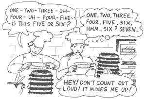
Why
do seven-layer cakes usually have fewer than seven layers?
We faced this investigation with the seriousness of Geraldo Rivera. But the bakers we spoke to laughed about the “scandal of the missing layers.”
A survey of bakeries in the City of Brotherly Love, Philadelphia, yielded not only guffaws but the startling revelation that the true seven-layer cake is an endangered species. The baker at D’Elain Pastries simply said, “People call it seven-layer cake, but it’s not seven layers. It’s four or five.” The closest the Swiss Bakery could come up with is a Dobosh cake, which has four layers of cake and three layers of frosting. Seven layers would “make too big of a cake.” At least the Eclair Bake Shoppe makes true seven-layer cakes at Passover, but its spokesperson indicated that most other bakeries don’t make them anymore. They take too much time to lay out.
We understand why, in the world of commerce, cakes might become inflated in price and deflated in layers, but even cook
books designed for home bakers conspire to eliminate the purity of the seven-layer cake. In his book
Practical Baking
, William Sultan begins his recipe with “Prepare 7 sheet pans…”, clearly indicating the intent of producing a true seven-layer pastry. But then why does the accompanying picture show a cake with only six layers?
At least Susan Purdy, author of
A Piece of Cake
, owns up to the confusion. Before presenting her recipe, she muses:
…I remember, as a child, always counting the layers just to check, feeling triumphant when the number varied, as it often did and still does, from the seven we consider traditional to nine or even twelve, depending upon the whim of the chef. Now the choice is yours…
We really couldn’t find anyone in the bakery trade who was upset about the misnamed seven-layer cake. Bakery engineering consultant Dr. Simon S. Jackel told us that most cakes have thick layers. The idea of the seven-layer cake was to create not a thicker cake but a normal-sized cake with extremely thin layers. To Jackel, all that is important in creating an authentic seven-layer cake is to make sure that each layer is separated by icing or filling.
May we offer a humble suggestion? How about bakeries simply calling their offerings “layer cakes”?