CSS: The Definitive Guide, 3rd Edition (21 page)
Read CSS: The Definitive Guide, 3rd Edition Online
Authors: Eric A. Meyer
Tags: #COMPUTERS / Web / Page Design
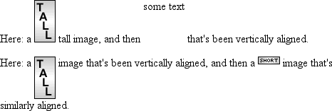
Employingvertical-align:tophas the opposite effect ofbottom. Likewise,vertical-align:text-topis the
reverse oftext-bottom.
Figure 6-15
shows how the following
markup would be rendered:
.up {vertical-align: top;}
.textup {vertical-align: text-top;}
Here: a  tall image, and then
some text that's been vertically aligned.
Here: a  image that's been
vertically aligned, and then a
image that's similarly aligned.

Figure 6-15. Aligning with the top and text-top of a line
Of course, the exact position of this alignment will depend on which elements
are in the line, how tall they are, and the size of the parent element's
font.
middle
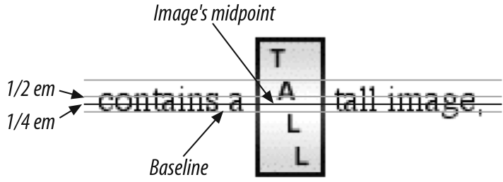
There's the valuemiddle, which is usually (but not always) applied to images. It does
not have the exact effect you might assume given its name.middlealigns the middle of an inline element's box
with a point that is0.5exabove the baseline
of the parent element, where1exis defined
relative to thefont-sizefor the parent
element.
Figure 6-16
shows this in
more detail.

Figure 6-16. Precise detail of middle alignment
Since most user agents treat1exas one-half em,middleusually aligns the vertical midpoint of an element with a point one-quarter em
above the parent's baseline. Don't rely on thishappening, however, since some user
agents actually calculate the exact x-height for each element. (See
Chapter 5
for more details on x-height.)
Percentages don't let you simulatealign="middle"for images. Instead, setting a percentage value forvertical-alignraises or lowers the baseline
of the element (or the bottom edge of a replaced element) by the amount declared,
with respect to the parent's baseline. (The percentage you specify is calculated
as a percentage ofline-heightfor the element,
not
its parent.) Positive percentage values raise the
element, and negative values lower it. Depending on how the text is raised or
lowered, it can appear to be placed in adjacent lines, as shown in
Figure 6-17
, so take care when using
percentage values:
sub {vertical-align: -100%;}
sup {vertical-align: 100%;}
We can either soar to new heights or, instead,
sink into despair...

Figure 6-17. Percentages and fun effects
Let's consider percentage values in more detail. Assume the following:
I felt that, if nothing else, I deserved a
raise for my efforts.
The50%-alignedspanelement has its baseline raised nine pixels, which is half of
the element's inheritedline-heightvalue of18px,
not
seven
pixels.
Finally, let's consider vertical alignment with a specific length.vertical-alignis very straightforward: it shifts an
element up or down by the declared distance. Thus,vertical-align:5px;will shift
an element upward five pixels from its unaligned placement. Negative length values
shift the element downward. This simple form of alignment did not exist in CSS1,
but it was added in CSS2.
It's important to realize that vertically aligned text does not become part of
another line, nor does it overlap text in other lines. Consider
Figure 6-18
, in which some vertically
aligned text appears in the middle of a paragraph.

Figure 6-18. Vertical alignments can cause lines to get taller
As you can see, any vertically aligned element can affect the height of the
line. Recall the description of a line box, which is exactly as tall as necessary
to enclose the top of the tallest inline box and the bottom of the lowest inline
box. This includes inline boxes that have been shifted up or down by vertical
alignment.
Now that we've dealt with alignment, let's
look at manipulating word and letter spacing. As usual, these properties have some
nonintuitive issues.
Theword-spacingproperty accepts a positive or
negative length. This length is
added
to the standard space
between words. In effect,word-spacingis used to
modify
inter-word spacing. Therefore, the default value ofnormalis the same as setting a value of zero
(0).
word-spacing
- Values:
| normal|inherit- Initial value:
normal- Applies to:
All elements
- Inherited:
Yes
- Computed value:
For
normal, the absolute length0; otherwise, the absolute
length
If you supply a positive length value, then the space between words will increase.
Setting a negative value forword-spacingbrings
words closer together:
p.spread {word-spacing: 0.5em;}
p.tight {word-spacing: -0.5em;}
p.base {word-spacing: normal;}
p.norm {word-spacing: 0;}
The spaces between words in this paragraph will be increased
by 0.5em.
The spaces between words in this paragraph will be decreased
by 0.5em.
The spaces between words in this paragraph will be normal.
The spaces between words in this paragraph will be normal.
Manipulating these settings has the effect shown in
Figure 6-19
.

Figure 6-19. Changing the space between words
So far, I haven't actually given you a precise definition of "word." In the
simplest CSS terms, a "word" is any string of nonwhitespace characters that is
surrounded by whitespace of some kind. This definition has no real semantic meaning;
it simply assumes that a document contains words surrounded by one or more whitespace
characters. A CSS-aware user agent cannot be expected to decide what is a valid word
in a given language and what isn't. This definition, such as it is, meansword-spacingis unlikely to work in any languages that
employ pictographs, or non-Roman writing styles. The property allows you to create
very unreadable documents, as
Figure 6-20
makes clear. Useword-spacingwith care.

Figure 6-20. Really wide word spacing
Many of the issues you
encounter withword-spacingalso occur withletter-spacing. The only real difference
between the two is thatletter-spacingmodifies
the space between characters, or letters.
letter-spacing
- Values:
| normal|inherit- Initial value:
normal- Applies to:
All elements
- Inherited:
Yes
- Computed value:
For length values, the absolute length; otherwise,
normal
As with theword-spacingproperty, the
permitted values ofletter-spacinginclude any
length. The default keyword isnormal(making it
the same asletter-spacing:0). Any length value you enter will increase or decrease
the space between letters by that amount.
Figure
6-21
shows the results of the following markup:
p {letter-spacing: 0;}    /*  identical to 'normal'  */
p.spacious {letter-spacing: 0.25em;}
p.tight {letter-spacing: -0.25em;}
The letters in this paragraph are spaced as normal.
The letters in this paragraph are spread out a bit.
The letters in this paragraph are a bit smashed together.

Figure 6-21. Various kinds of letter spacing
Usingletter-spacingto increase emphasis is a
time-honored technique. You might write the following declaration and get an effect
like the one shown in
Figure 6-22
:
strong {letter-spacing: 0.2em;}
This paragraph contains strongly emphasized text
that is spread out for extra emphasis.

Figure 6-22. Using letter-spacing to increase emphasis
The
value ofword-spacingmay be influenced by the
value of the propertytext-align. If an element is
justified,
the
spaces between letters and words may be altered to fit the text along the full width
of the line. This may in turn alter the spacing declared by the author withword-spacing. If a length value is assigned toletter-spacing, then it cannot be changed bytext-align, but if the value ofletter-spacingisnormal, then
inter-character spacing may be changed in order to justify the text. CSS does not
specify how the spacing should be calculated, so user agents simply fill it in.
As usual, the child of an element inherits the computed value of that element. You
cannot define a scaling factor forword-spacingorletter-spacingto be inherited in place of the
computed value (as is the case withline-height).
As a result, you may run into problems such as those shown in
Figure 6-23
:
p {letter-spacing: 0.25em; font-size: 20px;}
small {font-size: 50%;}
This spacious paragraph features tiny text that is just
as spacious, even though the author probably wanted the
spacing to be in proportion to the size of the text.

Figure 6-23. Inherited letter spacing
The only way to achieve letter spacing that's in proportion to the size of the
text is to set it explicitly, as follows:
p {letter-spacing: 0.25em;}
small {font-size: 50%; letter-spacing: 0.25em;}