CSS: The Definitive Guide, 3rd Edition (20 page)
Read CSS: The Definitive Guide, 3rd Edition Online
Authors: Eric A. Meyer
Tags: #COMPUTERS / Web / Page Design
[
ast
]
Hyphenation is not described in CSS because different languages have
different hyphenation rules. Rather than try to concoct a set of rules that
would most likely be incomplete, the specification simply avoids the
problem.
Now that we've covered horizontal alignment, let's move on to vertical
alignment. Since the construction of
lines is covered in much more detail in
Chapter 7
, I'll just stick to a quick overview here.
Theline-heightproperty refers to the distance
between the baselines of lines of text rather than the size of the font, and it
determines the amount by which the height of
each element's box
is increased or decreased. In the most basic cases, specifyingline-heightis a way to increase (or decrease) the
vertical space between lines of text, but this is a misleadingly simple way of
looking at howline-heightworks.line-heightcontrols the
leading
,
which is the extra space between lines
of text above and beyond the font's size. In other words, the difference between the
value ofline-heightand the size of the font is
the leading.
line-height
- Values:
| | | normal|inherit- Initial value:
normal- Applies to:
All elements (but see text regarding replaced and block-level
elements)- Inherited:
Yes
- Percentages:
Relative to the font size of the element
- Computed value:
For length and percentage values, the absolute value; otherwise, as
specified
When applied to a block-level element,line-heightdefines the minimum distance between text baselines within
that element. Note that it defines a minimum, not an absolute value, and baselines of
text can wind up being pushed further apart than the value ofline-height.line-heightdoes not affect layout for replaced elements, but it still
applies to them. (This subtle mystery is explained in
Chapter 7
.)
Every element in a line of text generates a
content
area
,
which is
determined by the size of the font. This content area in turn generates an
inline box
that is, in the absence of any other factors,
exactly equal to the content area. The leading generated byline-heightis one of the factors that increases or
decreases the height of each inline box.
To determine the leading for a given element, simply subtract the computed
value offont-sizefrom the computed value ofline-height. That value is the total amount
of leading. And remember, it can be a negative number. The leading is then divided
in half, and each half-leading is applied to the top and bottom of the content
area. The result is the inline box for that element.
As an example, let's say thefont-size(and
therefore the content area) is 14 pixels tall, and theline-heightis computed to 18 pixels. The difference (four pixels)
is divided in half, and each half is applied to the top and bottom of the content
area. This creates an inline box that is 18 pixels tall, with 2 extra pixels above
and below the content area. This sounds like a roundabout way to describe howline-heightworks, but there are excellent
reasons for the description.
Once all of the inline boxes have been generated for a given line of content,
they are then considered in the construction of the line box. A line box is
exactly as tall as needed to enclose the top of the tallest inline box and the
bottom of the lowest inline box.
Figure
6-7
shows a diagram of this process.
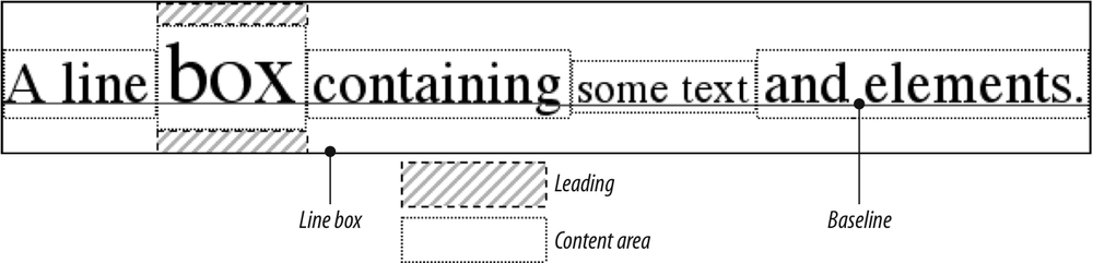
Figure 6-7. Line box diagram
Let's now consider the possible values ofline-height. If you use the default value ofnormal, the user agent must calculate the vertical space between
lines. Values can vary by user agent, but they're generally 1.2 times the size of
the font, which makes line boxes
taller than the value offont-sizefor a given
element.
Most values are simple length measures (e.g.,18pxor2em). Be aware that even if
you use a valid length measurement, such as4cm, the browser (or the operating system) may be using an incorrect
metric for real-world measurements, so the line height may not show up as exactly
four centimeters on your monitor. For more details, see
Chapter 4
.
em,ex, and
percentage values are calculated with respect to thefont-sizeof the element. The markup is relatively straightforward,
and the results are shown in
Figure
6-8
:
body {line-height: 14px; font-size: 13px;}
p.cl1 {line-height: 1.5em;}
p.cl2 {font-size: 10px; line-height: 150%;}
p.cl3 {line-height: 0.33in;}
This paragraph inherits a 'line-height' of 14px from the body, as well as
a 'font-size' of 13px.
This paragraph has a 'line-height' of 19.5px(13 * 1.5), so
it will have slightly more line-height than usual.
This paragraph has a 'line-height' of 15px (10 * 150%), so
it will have slightly more line-height than usual.
This paragraph has a 'line-height' of 0.33in, so it will have
slightly more line-height than usual.
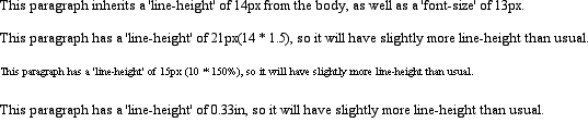
Figure 6-8. Simple calculations with the line-height property
inheritance
When theline-heightis inherited by one block-level element from another, things get a bit trickier.line-heightvalues inherit from the parent
element as computed from the parent, not the child. The results of the following
markup are shown in
Figure 6-9
. It
probably wasn't what the author had in
mind:
body {font-size: 10px;}
div {line-height: 1em;}  /* computes to '10px' */
p {font-size: 18px;}

This paragraph's 'font-size' is 18px, but the inherited 'line-height'
value is only 10px.  This may cause the lines of text to overlap each
other by a small amount.

Figure 6-9. Small line-height, large font-size, slight problem
Why are the lines so close together? Because the computedline-heightvalue of10pxwas inherited by the paragraph from its parentdiv. One solution to the smallline-heightproblem depicted in
Figure 6-9
is to set an explicitline-heightfor every element, but that's not very
practical. A better alternative is to specify a number, which actually sets a
scaling
factor:
body {font-size: 10px;}
div {line-height: 1;}
p {font-size: 18px;}
When
you specify a number, you cause the scaling factor to be an inherited value
instead of a computed value. The number will be applied to the element and all of
its child elements, so that each element has aline-heightcalculated with respect to its ownfont-size(see
Figure
6-10
):
div {line-height: 1.5;}
p {font-size: 18px;}

This paragraph's 'font-size' is 18px, and since the 'line-height'
set for the parent div is 1.5, the 'line-height' for this paragraph
is 27px (18 * 1.5).
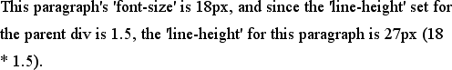
Figure 6-10. Using line-height factors to overcome inheritance problems
Though it seems likeline-heightdistributes extra space both above and below each line of text,
it actually
adds (or subtracts) a certain amount from the top and bottom of an inline
element's content area to create an inline box. Assume that the defaultfont-sizeof a paragraph is12ptand consider the
following:
p {line-height: 16pt;}
Since
the "inherent" line height of 12-point text is 12 points, the preceding rule will
place an extra 4 points of space around each line of text in the paragraph. This
extra amount is divided in two, with half going above each line and the other half
below. You now have 16 points between the baselines, which is an indirect result
of how the extra space is apportioned.
If you specify the valueinherit, then the element will use the
computed value for its parent element. This isn't really any different than
allowing the value to inherit naturally, except in terms of specificity and
cascade resolution. See
Chapter 3
for details
on these topics.
Now that you have a basic grasp of how lines are
constructed, let's talk about vertically aligning elements relative to the line
box.
If you've ever used the
elementssupandsub(the superscript and subscript elements), or used an image with markup
such as
then you've done some rudimentary vertical alignment. In CSS, thevertical-alignproperty applies only to inline elements
and replaced elements such as images and form inputs.vertical-alignis not an inherited property.
vertical-align
- Values:
baseline|sub|super|top|text-top|middle|bottom|text-bottom|| | inherit- Initial value:
baseline- Applies to:
Inline elements and table cells
- Inherited:
No
- Percentages:
Refer to the value of
line-heightfor the element- Computed value:
For percentage and length values, the absolute length; otherwise, as
specified- Note:
When applied to table cells, only the values
baseline,top,middle, andbottomare recognized
vertical-alignaccepts any one of eight keywords,
a percentage value, or a length value. The keywords are a mix of the familiar and
unfamiliar:baseline(the default value),sub,super,bottom,text-bottom,middle,top,
andtext-top. We'll examine how each keyword works
in relation to inline elements.
Remember:vertical-aligndoes
not
affect the alignment of content within a block-level
element. You can, however, use it to affect the vertical alignment of elements
within table cells. See
Chapter 11
for
details.
alignment
vertical-align:baselineforces the baseline of an element to align with the
baseline of its parent. Browsers, for the most part, do this anyway, since you'd
obviously expect the bottoms of all text elements in a line to be
aligned.
If a vertically aligned element doesn't have a baseline—that
is, if it's an image, a form input, or another replaced element—then the bottom of
the element is aligned with the baseline of its parent, as
Figure 6-11
shows:
img {vertical-align: baseline;}
The image found in this paragraph  has its
bottom edge aligned with the baseline of the text in the paragraph.

Figure 6-11. Baseline alignment of an image
This alignment rule is important because it causes some web browsers
to always put a replaced element's bottom edge on the baseline, even if there is
no other text in the line. For example, let's say you have an image in a table
cell all by itself. The image may actually be on a baseline, but in some browsers,
the space below the baseline causes a gap to appear beneath the image. Other
browsers will "shrink-wrap" the image with the table cell, and no gap will appear.
The gap behavior is correct, according to the CSS Working Group, despite its lack
of appeal to most authors.
See my article "Images, Tables, and Mysterious Gaps" at
http://developer.mozilla.org/en/docs/Images,_Tables,_and_Mysterious_Gaps
for a more detailed explanation of gap behavior and ways to work around it.
Chapter 7
also covers this aspect of
inline layout in more detail.
subscripting
The declarationvertical-align:subcauses an
element to be subscripted, meaning that its baseline (or bottom, if it's a
replaced element) is lowered with respect to its parent's baseline. The
specification doesn't define the distance the element is lowered, so it may vary
depending on the user agent.
superis the opposite ofsub; it raises the element's baseline (or bottom of a
replaced element) with respect to the parent's baseline. Again, the distance the
text is raised depends on the user agent.
Note that the valuessubandsuperdo
not
change the element's font size, so
subscripted or superscripted text will not become smaller (or larger). Instead,
any text in the sub- or superscripted element should be, by default, the same size
as text in the parent element, as illustrated by
Figure
6-12
:
span.raise {vertical-align: super;}
span.lower {vertical-align: sub;}
This paragraph contains superscripted
and subscripted text.

Figure 6-12. Superscript and subscript alignment
If you wish to make super- or subscripted text smaller than the text of its
parent element, you can do so using the propertyfont-size, which is covered in
Chapter 5
.
feeding
vertical-align:bottomaligns the bottom of the element's inline box with the bottom of
the line box. For example, the following markup results in
Figure
6-13
:
.feeder {vertical-align: bottom;}
This paragraph, as you can see quite clearly, contains
a  image and
a  image,
and then some text that is not tall.
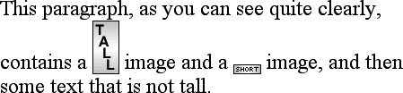
Figure 6-13. Bottom alignment
The second line of the paragraph in
Figure 6-13
contains two inline elements,
whose bottom edges are aligned with each other. They're also below the baseline of
the text.
vertical-align:text-bottomrefers to the bottom of the text in the line. For the
purposes of this value, replaced elements, or any other kinds of non-text
elements, are ignored. Instead, a "default" text box is considered. This default
box is derived from thefont-sizeof the parent
element. The bottom of the aligned element's inline box is then aligned with the
bottom of the default text box. Thus, given the following markup, you get a result
like the one shown in
Figure
6-14
:
img.tbot {vertical-align: text-bottom;}
Here: a
image, and then a  image.
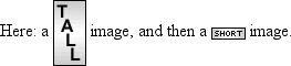
Figure 6-14. Text-bottom
alignment