CSS: The Definitive Guide, 3rd Edition (52 page)
Read CSS: The Definitive Guide, 3rd Edition Online
Authors: Eric A. Meyer
Tags: #COMPUTERS / Web / Page Design
The simplest of the positioning schemes to understand
is relative
positioning. In this scheme, a positioned element is shifted by use of the offset
properties. However, this can have some interesting consequences.
On the surface, it seems simple enough. Suppose you want to shift an image up and
to the left.
Figure 10-58
shows you the
result of these styles:
img {position: relative; top: -20px; left: -20px;}
Figure 10-58. A relatively positioned element
All you've done here is offset the image's top edge 20 pixels upward and offset
the left edge 20 pixels to the left. However, notice the blank space where the image
would have been, had it not been positioned. This happened because when an element is
relatively positioned, it's shifted from its normal place, but the space it would
have occupied doesn't disappear. Consider the results of the following styles, which
are depicted in
Figure 10-59
:
em {position: relative; top: 8em; color: gray;}
Figure 10-59. A relatively positioned element
As you can see, the paragraph has some blank space in it. This is where theemelement would have been, and the layout of
theemelement in its new position exactly mirrors
the space it left behind.
Of course, it's also possible to shift a relatively positioned element to overlap
other content. For example, the following styles and markup are illustrated in
Figure 10-60
:
img.slide {position: relative; left: 30px;}

In this paragraph, we will find that there is an image that has been pushed to
the right.  It will therefore
overlap content nearby, assuming that it is not the last element in its line box.
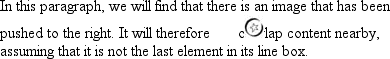
Figure 10-60. Relatively positioned elements can overlap other content
As we saw in previous sections, when you relatively position an element, it
immediately establishes a new containing block for any of its children. This
containing block corresponds to the place where the element has been positioned.
There is one interesting wrinkle to relative positioning. What happens when a
relatively positioned element is overconstrained? For example:
strong {position: relative; top: 10px; bottom: 20px;}
Here you have values that call for two very different behaviors. If you consider
onlytop:10px,
then the element should be shifted downward 10 pixels, butbottom:20pxclearly calls for the
element to be shifted upward 20 pixels.
The original CSS2 specification does not say what should happen in this case.
CSS2.1 states that when it comes to overconstrained relative positioning,
one value is reset to be the negative of the
other. Thus,bottomwould always equal -top. This means that the previous example would be
treated as though it had been:
strong {position: relative; top: 10px; bottom: -10px;}
Thus, thestrongelement will be shifted
downward 10 pixels. The specification also makes allowances for writing directions.
In relative positioning,rightalways equals-leftin left-to-right languages, but in
right-to-left languages, this is reversed:leftwould always equal-right.
[
*
]
Yes, the spelling of "positioning" is incorrect, but that's the way the
language crumbles. The page is still a good source of information.
Floating and positioning are very compelling features of CSS. They're also likely to
be an exercise in frustration if you're careless in how you use them. Element
overlapping, stacking order, size, and placement all have to be considered carefully
when elements are positioned, and floated elements' relation to the normal flow must
also be taken into account. Creating layouts using floating and positioning can thus
take some adjustment, but the rewards are well worth the price.
While it's true that a great deal of layout can thus be freed of tables, there are
still reasons to use tables on the Web, such as presenting stock quotes or sports
scores, among others. In the next chapter, we'll examine how CSS has grown to address
the question of table layout.
You may have glanced at the title of this chapter and wondered, "Table layout? Isn't
that exactly what we're trying to avoid doing?" Indeed so, but this chapter is not about
using tables
for
layout. Instead, it's about the ways that tables themselves are
laid out within CSS, which is a far more complicated affair than it might first appear.
That's why the subject warrants its own chapter.
Tables are unique, compared to the rest of document layout. As of CSS2.1, tables alone
possess the ability to associate element sizes with other elements—all the cells in a row
have the same height, for example, no matter how much or how little content each individual
cell might contain. The same is true for the widths of cells that share a column. There is
no other situation in layout where elements from different parts of the document tree
influence one another's sizing and layout in such a direct way.
As we'll see, this uniqueness comes at the expense of a great many behaviors and rules
that apply to tables, and only tables. In the course of the chapter, we'll look at how
tables are visually assembled, two different ways to draw cell borders, and the mechanisms
that drive the height and width of tables and their internal elements.
Before you can start to worry about how cell borders
are drawn and tables sized, we need to delve into the fundamental ways in which tables
are assembled, and the ways that elements within the table are related to one another.
This is referred to astable formatting, and it is
quite distinct from table layout: the latter is possible only after the former has been
completed.
The first thing to understand is how CSS defines the arranging of tables. While
this knowledge may seem a bit basic, it's key to understanding how best to style
tables.
CSS draws a distinction between table elements and internal table
elements.
In CSS, internal table elements generate rectangular
boxes that have content, padding, and borders, but do not have margins. Therefore, it
is
not
possible to define the separation between cells by giving
them margins. A CSS-conformant browser will ignore any attempts to apply margins to
cells, rows, or any other internal table element (with the exception of captions,
which are discussed later in this chapter).
There are six rules for arranging tables. The basis of these rules is a "grid
cell," which is one area between the grid lines on which a table is drawn. Consider
Figure 11-1
, in which two tables are
shown along with their grid cells,
which are
indicated by the dashed lines drawn over the tables.
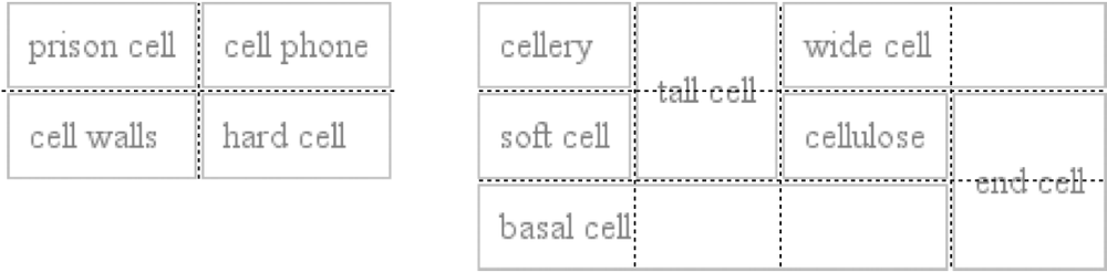
Figure 11-1. Grid cells form the basis of table layout
In a simple two-by-two table, such as the lefthand table shown in
Figure 11-1
, the grid cells correspond to
the cells. In a more complicated table, like the righthand one in
Figure 11-1
, the edges of the grid cells
correspond to the cell borders of all the cells in the table, and cut through those
cells that span rows or columns.
These grid cells are largely theoretical constructs, and they cannot be styled or
even accessed through the document object model. They simply serve as a way to
describe how tables are assembled for styling.
rules
Each row box encompasses a single row of grid cells. All of the row
boxes
in a table fill the table from top to bottom in the order they occur in the
source document (with the exception of any table header or table footer row
boxes, which come at the beginning and end of the table, respectively).
Thus, the table contains as many grid rows as there are row elements.A row group's box encompasses the same grid cells as the row boxes it
contains.A column box encompasses one or more columns of grid cells. All of the
column boxes
are placed next to one another in the order
they occur. The first column box is on the left for left-to-right languages,
and on the right for right-to-left languages.A column group's box encompasses the same grid cells as the column boxes
that it contains.Although cells may span several rows or columns, CSS does not define how
this happens. Instead, the document language defines spanning.
Each spanned cell is a rectangular box one or more grid cells wide and high.
The top row of this rectangle is in the row that is parent to the cell. The
cell's rectangle must be as far to the left as possible in left-to-right
languages, but it may not overlap any other cell box. It must also be to the
right of all cells in the same row that are earlier in the source document
in a left-to-right language. In right-to-left languages, a spanned cell must
be as far to the right as possible without overlapping other cells, and must
be to the left of all cells in the same row that follow it in the document
source.A cell's box cannot extend beyond the last row box of a table or row
group. If the table structure would create this condition, the cell must be
shortened until it fits within the table or row group that encloses
it.
The CSS specification discourages, but does not prohibit, the
positioning
of
table cells and other internal table elements. Positioning a row that contains
row-spanning cells, for example, could dramatically alter the layout of the
table by removing the row from the table entirely, and thus removing the
spanned cells from consideration in the layout of other rows.
By definition, grid cells
are
rectangular, but they do not all have to be the same size. All the grid cells in a
given grid column will be the same width, and all the grid cells in a grid row
will be the same height, but the height of one grid row may be different from that
of another grid row. Similarly, grid columns may be of different
widths.
With those basic rules in mind, you may ask the question: how,
exactly, do you know which elements are cells and which are not? We'll find out in
the next section.
In HTML, it's easy
to know which elements are parts of tables because the handling of elements liketrandtdis
built into browsers. In XML, on the other hand, there is no way to intrinsically know
which elements might be part of a table. This is where a whole collection of values
fordisplaycomes into play.
In this chapter, we'll stick to the table-related values, as the others (block,inline,inline-block,run-in, andlist-item) are discussed in
other chapters. The table-related values can be summarized as follows:
tableThis value specifies that an element defines a block-level
table. Thus, it defines a rectangular block that generates a block box. The
corresponding HTML element is, not surprisingly,table.inline-tableThis value specifies that an element defines an inline-level
table. This means the element defines a rectangular block that generates an
inline box. The closest non-table analog is the valueinline-block. The closest HTML element istable, although, by default, HTML
tables are not inline.table-rowThis value specifies that an element is a row of cells. The corresponding
HTML element is thetrelement.table-row-groupThis value specifies that an element groups one or more rows. The
corresponding HTML value istbody.table-header-groupThis value is very much like
table-row-group, except that for visual formatting, the header
row group is always displayed before all other rows and row groups and after
any top captions. In print, if a table requires multiple pages to print, a
user agent may repeat header rows at the top of each page. The specification
does not define what happens if you assigntable-header-groupto multiple elements. A header group can
contain multiple rows. The HTML equivalent isthead.table-footer-groupThis value is very much like
table-header-group, except that the footer row group is always
displayed after all other rows and row groups and before any bottom
captions. In print, if a table requires multiple pages to print, a user
agent may repeat footer rows at the bottom of each page. The specification
does not define what happens if you assigntable-footer-groupto multiple elements. This is equivalent to
the HTML elementtfoot.table-columnThis value declares that an element describes a column of cells. In CSS
terms, elements with thisdisplayvalue
are not visually rendered, as if they had the valuenone. They exist primarily to help define the presentation of
cells within the column. The HTML equivalent is thecolelement.table-column-groupThis value declares that an element groups one or more columns. Like
table-columnelements,table-column-groupelements are not rendered,
but the value is useful for defining presentation for elements within the
column group. The HTML equivalent is thecolgroupelement.table-cellThis value specifies that an element represents a single cell in a table.
The HTML elementsthandtdare both examples oftable-cellelements.table-captionThis value defines a table's caption. CSS does not define what should
happen if multiple elements have the valuecaption, but it does explicitly warn, "...authors should not put
more than one element with 'display: caption' inside a table or inline-table
element."
display
- Values:
none|inline|block|inline-block|list-item|run-in|table|inline-table|table-row-group|table-header-group|table-footer-group|table-row|table-column-group|table-column|table-cell|table-caption|inherit- Initial value:
inline- Applies to:
All elements
- Inherited:
No
- Computed value:
Varies for floated, positioned, and root elements (see CSS2.1, section
9.7); otherwise, as specified- Note:
The values
compactandmarkerappeared in CSS2 but were dropped
from CSS2.1 due to a lack of widespread support
You can get a quick summary of the general effects of these values by taking an
excerpt from the example HTML 4.0 style sheet given in
Appendix C
:
table           {display: table;}
tr              {display: table-row;}
thead           {display: table-header-group;}
tbody           {display: table-row-group;}
tfoot           {display: table-footer-group;}
col             {display: table-column;}
colgroup        {display: table-column-group;}
td, th          {display: table-cell;}
caption         {display: table-caption;}
In XML, where elements will not have display semantics by default, these values
become quite useful. Consider the following markup:
Reds 8 Cubs 5
This could be formatted in a tabular fashion using the following styles:
scores {display: table;}
headers {display: table-header-group;}
game {display: table-row-group;}
team {display: table-row;}
label, name, score {display: table-cell;}
The various cells could then be styled as necessary—e.g., boldfacing thelabelelements and right-aligning the scores.
While it's theoretically possible to assign table-relateddisplayvalues to any HTML element, Internet Explorer
up through IE7 does not support this capability.
primacy
CSS defines its table model as "row primacy." In other
words, the model assumes that authors will create markup languages where rows are
explicitly declared. Columns, on the other hand, are derived from the layout of
the rows of cells. Thus, the first column is comprised of all the first cells in
each row, the second column of the second cells, and so forth.
Row
primacy is not a major issue in HTML, where the markup language is already
row-oriented. In XML, it has more of an impact because it constrains the way in
which authors can define table markup. Because of the row-oriented nature of the
CSS table model, a markup language in which columns are the basis of table layout
is not really possible (assuming that the intent is to use CSS to present such
documents).
The row primacy of the CSS model will also be evident
throughout the rest of the chapter as we explore the details of table
presentation.
Although the CSS table model is row-oriented, columns do still play a part in
layout. A cell can belong to both contexts (row and column), even if they are
descended from row elements in the document source. In CSS, however, columns and
column groups can accept only four styles:border,background,width, andvisibility.
In addition, each of these four properties has special rules that apply only in
the columnar context:
borderBorders can be set for columns and column groups
only if the propertyborder-collapsehas the valuecollapse. In such circumstances, column and
column-group borders participate in the collapsing algorithm that sets
the border styles at each cell edge. (See "
Collapsing Cell Borders
"
later in this chapter.)backgroundThe background of a column or column group will be visible only in
cells where both the cell and its row have transparent backgrounds. (See
"
Table Layers
" later in
this chapter.)widthThe
widthproperty defines the
minimum
width of
the
column or column group. The content of cells within the column (or group)
may force the column to become wider.visibilityIf the value of
visibilityfor a
column or column group iscollapse,
then none of the cells in the column (or group) are rendered. Cells that
span from the collapsed column into other columns are clipped, as are
cells that span from other columns into the hidden column. Furthermore,
the overall width of the table is reduced by the width that the column
would have taken up. A declaration of any value forvisibilityother thanhiddenfor a column or column group is
ignored.