Revolution in the Valley: The Insanely Great Story of How the Mac Was Made (46 page)
Read Revolution in the Valley: The Insanely Great Story of How the Mac Was Made Online
Authors: Andy Hertzfeld
Tags: #Business & Economics, #General, #Industries, #Computers & Information Technology, #Workplace Culture, #Research & Development, #Computers, #Operating Systems, #Macintosh, #Hardware
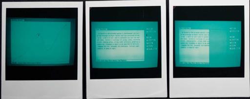
The next picture shows that we dropped the proportional scroll box for a simpler, fixed-size one, since we were afraid users wouldn't understand the proportionality. It also shows the I-Beam text cursor for the first time. At this point, we were finally committed to the one-button mouse, after a long, protracted internal debate.
The right most picture shows Bill playing around with splines, which are curves defined by a few draggable control points. QuickDraw didn't end up using splines, but the picture is still notable for the first appearance of the "knobbie" (a small, draggable, rectangular affordance for a point).
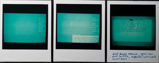
By now, it's the fall of 1980. The middle picture shows us experimenting with opened and closed windows, which was eventually dropped (but it made a comeback in the 1990s and is in most systems today one way or another). The right most picture shows the first window resizing, by dragging a gray outline, although it's not clear how resizing was initiated.
The middle picture shows that windows can be repositioned by dragging a gray outline. We wanted to drag the whole window, like modern user interfaces do today, but the processors weren't fast enough in those days. As far as I know, the NeXTStep was the first system to do it the modern way.
The right most picture shows the first appearance of pull-down menus, with a menu bar at the top of the window instead of the top of the screen, which is the way Windows still does things. By this point, we also gave up on using a single scroll bar for both horizontal and vertical scrolling; it's looking very much like what the Mac shipped with in 1984 now.
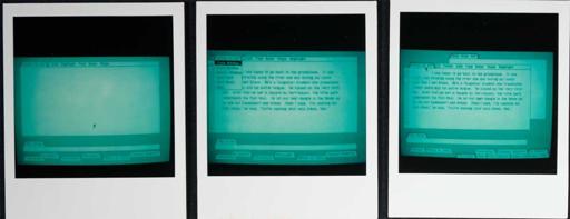
This set of pictures illustrates the Lisa desktop, circa the end of 1980, with a tab-shaped title, followed by a menu bar attached to the window. Windows could be reduced to tabs on the desktop. We've also changed the name of the clipboard to "the scrap", an old typesetting term.
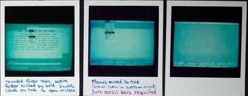
The leftmost picture mentions the first use of double-click, to open and close windows. The middle picture represents a real breakthrough, by putting the menu bar at the top of the screen instead of the top of each window. The menu bar contains the menus of the "active folder", which is the topmost window. By this point, the grow icon found its way to the bottom right, at the intersection of the horizontal and vertical scrollbars, which stuck. This is the first picture which is really recognizable as the shipping Macintosh.
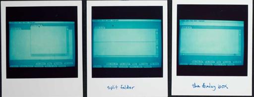
By now, it's early 1981, and things are beginning to shape up. The leftmost picture shows a window with scrollbars that look a lot like the ones that shipped. The middle folder illustrates split views, which were used by Lisa's spreadsheet application. The rightmost picture contains the first appearance of a dialog box, which at the time ran the entire length of the screen, just below the menu bar.
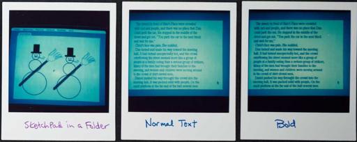
Now that the basic window structure was stabilizing, Bill turned his attention back to the graphics routines. He worked more on the Sketch program (the forerunner of MacPaint); the snowman drawing on the left is a clue that it's now Winter 1981. He added algorithmic text styles to the graphics, adding styles of bold (pictured on the right), as well as italic, outline and shadow (Bill took pictures of the other styles which I'm omitting to save space).
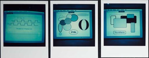
Bud Tribble was living at Bill's house now, and tended to sleep during the day and work all night, so Bill drew the phase diagram diagram on the left with the sketch program. The middle picture shows fast ovals, which were added to LisaGraf as a basic type in Spring 1981, using a clever algorithm that didn't require multiplication. They were quickly followed by rectangles with rounded corners, or "roundrects", illustrated on the right, which were suggested by Steve Jobs (see
round rects are everywhere!
).
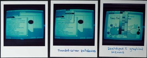
By May 1981, the Lisa user interface is beginning to solidify. The leftmost photo shows scrollable documents of different types in overlapping windows, still sporting folder tabs for titles. The middle picture shows how roundrects began to creep into various UI elements, like menus, providing a more sophisticated look, especially when combined with drop shadows. The right most photo shows how menus could be also be graphical, as well as text based.
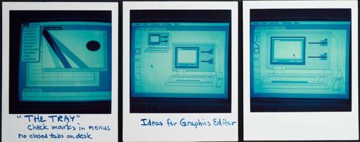
The Lisa team was worried about the closed window tabs being obscured by other windows on the desktop, so Bill added a standard menu on the extreme left called "the tray", that could show and hide opened windows. The middle and right pictures portray a prototype that Bill created for the Lisa Graphics Editor (which eventually evolved into MacDraw), to demonstrate that modes could sometimes be useful; it was the first program to select modes with a graphical palette, which eventually became the main user interface of MacPaint.
