unSpun (5 page)
Journalists are as guilty as anybody. Words such as “largely” conceal a writer's ignorance of the true number. “Largely” could mean anything up to half. “Most” means more than half, but how much more? “Several” can mean any number higher than two or three, but less than “many.” A sentence that begins “Fifty-three Nobel Prizeâwinning scientists” has specific meaning, and the writer should be able to name all fifty-three if challenged. But a sentence that starts with “Many scientists” is a hollow shell that should alert us to the possibility that the writer is a bit hazy about the facts. One of the first things a journalist learns is how to “write around it” when a deadline is looming and there's no time to fill a factual hole in the story. Readers should be aware of the weasel words used to disguise those holes.
TRICK #4:
Eye Candy
I
F YOU JUST LISTENED TO THE ANNOUNCER, A
TV
AD FOR THE ANTIDEPRESSANT
prescription drug Paxil CR was quite direct about some of the unpleasant consequences that might result from taking it: “Side effects may include nausea, sweating, sexual side effects, weakness, insomnia, or sleepiness.” But if you just looked at the pictures on screen, you got a totally different impression. An attractive young woman was shown walking her dog in a park, chatting with friends, smiling, obviously depression free. She wasn't sweating or sick to her stomach. She was strong, not weak. Her eyelids weren't drooping, nor was she complaining of a sleepless night. The announcer continued: “Don't stop taking Paxil CR before talking to your doctor, since side effects may result from stopping the medicine.” The announcer was in effect saying that this drug can even cause withdrawal symptoms for those who quit “cold turkey,” but what viewers were seeing on screen were some laughing construction workers happily taking a coffee break from the job. Viewers weren't seeing any of the undesirable possible side effects they were being told about, and as a result, many of them probably weren't actually hearing the words or taking them into account.
Propagandists know that when words say one thing and pictures say another, it's the pictures that count. Scholars tell us that redundancy is correlated with retention. To minimize retention, a propagandist says one thing while showing the opposite. When the two differ, what we see tends to override what we hear.
Drug companies have become particularly adept at showing us smiling faces and flowery pictures while the narrator recites material they hope we won't notice, such as those lists of unpleasant and even debilitating or dangerous possible side effects. In this case, the FDA thought that GlaxoSmithKline, the makers of Paxil CR, had gone too far. On June 9, 2004, the FDA ordered the ad off the air as “false or misleading,” partly because it “fails clearly to communicate the major risks associated with Paxil CR.” The FDA denounced the use of pictures and sound to overwhelm the announcer's words. “The compelling and attention-grabbing visuals and other competing modalities, such as background musicâ¦make it difficult for consumers adequately to process and comprehend the risk information,” the FDA said.
The CBS reporter Lesley Stahl learned about this same effect the hard way. According to Stahl, she was worried that a report in which she criticized Ronald Reagan during his 1984 reelection campaign was so tough that her White House sources might “freeze me out.” No worries: a Reagan aide, Richard Darman, called her afterward to say “What a great piece. We loved it.” As Stahl wrote in her book
Reporting Live,
the exchange continued:
S
TAHL
: “Why are you so happy? Didn't you hear what I said?”
D
ARMAN
: “Nobody heard what you said.”
S
TAHL
: “Come again?”
D
ARMAN
: “You guys in Televisionland haven't figured it out, have you? When the pictures are powerful and emotional, they override if not completely drown out the sound. Lesley, I mean it, nobody heard you.”
Her TV story had shown generally upbeat pictures of Reagan, and according to Darman those pictures were all that viewers carried away from her critical report. Darman had explained the basic principle of the “eye candy” effect: pictures tend to overpower spoken words. It's just the way we human beings are wired.
Research by Kathleen Jamieson documented the eye candy effect in 1988 and 1989. During the presidential election campaign of 1988, groups of voters were asked what they remembered seeing in news in the past week. In one week, ABC News correspondent Richard Threlkeld had debunked distortions in both an ad by Republican nominee George H. W. Bush and an ad by Democratic nominee Michael Dukakis. To the surprise of the moderators, some ABC viewers could recall what the ads said, but not what Threlkeld had said about them. In 1989, Jamieson showed audiences the full twenty-two minute newscasts that included the Threlkeld piece and then asked the viewers to write down everything they remembered from Threlkeld's report. Only thirty minutes after seeing the debunking, viewers still remembered the attacks in the Bush and Dukakis ads better than the reporter's corrections. The reason? Threlkeld had illustrated his stories by filling up the screen with the political spots, while his criticisms were spoken.
Just as Darman would have predicted, Threlkeld's spoken words were overwhelmed by the provocative pictures and graphics. In the Republican ad, printed text specifying weapons systems the Democrat supposedly opposed was superimposed over video of Dukakis riding in a tank. In the Democratic ad, a Social Security card was torn up. Viewers failed to get Threlkeld's message, which was that Dukakis actually favored some of the weapons the ad said he opposed and that the two candidates had the same position on Social Security.
These days TV reporters who do “adwatch” stories are usually careful to avoid the eye-candy effect. That's thanks in part to Annenberg's research. Annenberg advised reporters to use special graphic techniques, showing the offending ad “boxed” in a cartoonlike TV set so that viewers don't confuse the ad's message with the reporter's message, and imposing graphics over the ad to reinforce their points of criticism. But deceivers have learned a trick or two also, as we see in those pharmaceutical ads that use feel-good pictures to soften the unpleasant truth about the potential side effects of their products. Also, politicians have taken to slapping their slogans on banners and backdrops where TV cameras necessarily show them, so the speaker's message gets across visually even if the news soundtrack doesn't contain a single word he or she spoke.
An example of that is President Bush's appearance on November 30, 2005, at the U.S. Naval Academy. His message of the dayâthat he had a “plan for victory” in Iraqâwas reinforced with banners above and below the podium. We can make fun of Bush for appearing in front of a banner reading “Mission Accomplished” two and a half years earlier, on May 1, 2003, aboard the aircraft carrier U.S.S.
Abraham Lincoln.
That bit of eye candy was, to say the least, premature. But, regardless of what the reporters were saying about them, each of Bush's messages was punched through by visuals that were powerful, whether or not they were valid.
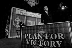
A message conveyed by “eye candy.” AP Images.
Visuals also can be used to reinforce a false message that the deceiver can't state outright. In 2005 the abortion rights group NARAL Pro-Choice America ran a TV ad showing a bombed-out abortion clinic and a disfigured victim, while the voice-over said that Supreme Court nominee John Roberts “filed court briefs supporting violent fringe groups and a convicted clinic bomber,” and adding: “America can't afford a justice whose ideology leads him to excuse violence.” Roberts had in fact condemned clinic bombers and violence, but those powerful pictures transmitted the emotional message that Roberts had endorsed the mayhem being shown, even though the narrator stopped just short of saying that explicitly. FactCheck.org called that ad false and NARAL quickly pulled it off the air. Even the group's allies criticized it.
When you see dramatic images, listen to the “fine print.” Ask yourself, “What are my
ears
telling me about this picture?” A picture can indeed be worth a thousand wordsâbut those words aren't necessarily true.
TRICK #5:
The “Average” Bear
S
OMETIMES THE “AVERAGE” BEARS WATCHING
. P
RESIDENT
B
USH
sold his tax cuts to the public by claiming the “average tax cut” would be $1,586, but most of us were never going to see anywhere near that much. Half of Americans got $470 or less, according to the nonpartisan Tax Policy Center. Bush wasn't lying, just using a common mathematical trick. When most people hear the word “average” they think “typical.” But the average isn't always typical, especially when it comes to the federal income tax: very wealthy people pay a very large share of the taxes and stand to get a very large share of benefits when those taxes are cut.
To see the “average bear” trick clearly, consider this simplified example. Imagine a small town of a thousand persons, including one superrich resident whom we'll call Gil Bates. Everybody in town is getting a tax cut this year: $10 for everybody but Mr. Bates, who is getting a whopping cut of $90,010. What's the average? Divide the sum of all the tax cuts ($100,000) by the total number of residents (1,000) and the
average
works out to $100 per resident. But that's not the
typical
cut. In our example, the average tax cut was ten times as large as the typical tax cut. Bush's “average” figure was like that. Big reductions for a relative few at the top of the income scale pulled up the average to a figure higher than was typical for most working Americans.
Bush also likes to point to increases in “average” income since he took office, as though everybody were enjoying improved financial well-being. For example, his White House staff issued a “fact sheet” in February 2006 that crowed, “Real after-tax income per person has risen 7.9 percent” since the president took office five years earlier. That figure accurately cites the latest quarterly statistics from the Department of Commerce, and it's true that many Americans did very well financially during Bush's first five years. But the average is misleading. Most of the gains were at the top, and many if not most Americans lost ground.
We know that was true for Bush's first four years, because for that period we have a better measure: a median figure, not an average. The median is the midpoint: half do better, half do worse. In 2005, according to a massive annual survey conducted by the Census Bureau, the median inflation-adjusted income per household since Bush took office had
fallen
by 2.7 percent, to $46,326. That's a before-tax figure, not strictly comparable to the after-tax figure the president prefers, but the $470 tax cut we mentioned earlier (also a median figure) wouldn't make up for the $1,273 decline in median before-tax income.
Other statistics fill in a picture of upper-income Americans gaining while lower-income Americans slipped back during this time. The strongest of these is the poverty rate, which went up under Bush, from 11.3 percent in Bill Clinton's final year to 12.6 percent in 2005. An estimated 5.4 million Americans fell into poverty, more people than live within the city limits of Chicago and Houston combined. This is a good example of why we say that the “average” bears watching.
When you hear “average,” always ask, “Does that really mean âtypical'?” A single number seldom tells the whole story, especially with something as big and complicated as the U.S. economy or the federal tax system.
TRICK #6:
The Baseline Bluff
T
HIS ONE IS A FAVORITE OF
D
EMOCRATS IN THE
U
NITED
S
TATES
, but it works in other countries as well. In Britain's 2005 elections, the Labour party plastered yellow “Warning” posters all over Britain claiming “The Tories will cut £35bn from public services.” Actually, the Tories planned to
increase
spending, by £181 billion. But that increase was £35 billion smaller than the one Labour planned, so Labour called it a cut. As the British television network Channel 4 put it on their own “FactCheck” website: “In nominal terms, therefore, the £35bn is just a smaller increase, rather than a cut.”
The same trick is used over and over in U.S. elections. In 1996, Bill Clinton accused his opponent, Bob Dole, of trying to “cut” Medicare by $270 billion. Actually, Dole and Republicans in Congress had never proposed to reduce the amount of money spent on Medicare, merely to hold down the rate of increase. Their plan could only be called a “cut” in relation to projected future spending, what budget experts like to call the “baseline.” Clinton himself had proposed a “cut” of $124 billion in projected Medicare spending, without calling it that.