CSS: The Definitive Guide, 3rd Edition (39 page)
Read CSS: The Definitive Guide, 3rd Edition Online
Authors: Eric A. Meyer
Tags: #COMPUTERS / Web / Page Design
As the definition ofcolorindicates, the property is inherited. This makes sense since if you
declarep {color:gray;}, you probably expect that any text within that paragraph will also
be gray, even if it's emphasized, boldfaced, etc. Of course, if you
want
such elements to be different colors, that's easy enough,
as illustrated in
Figure 9-7
:
em {color: gray;}
p {color: black;}

Figure 9-7. Different colors for different elements
Since color is inherited, it's theoretically possible to set all of the ordinary
text in a document to a color, such as red, by declaringbody {color:red;}. This should make
red all text that is not otherwise styled (such as anchors, which have their own
color styles). However, it's still possible to find browsers that have predefined
colors for things like tables, which preventbodycolors from inheriting into table cells. In such browsers, since acolorvalue is defined by the browser fortableelements, the browser's value will take precedence
over the inherited value. This is annoying and unnecessary, but, luckily, it's simple
to overcome (usually) by using selectors that list various table elements. For
example, to make all of your table content red along with your document's body, try
this:
body, table, td, th {color: red;}
This will generally solve the problem. Note that using such selectors is
unnecessary with most modern browsers, which have long since fixed inheritance bugs
that plagued them in earlier versions.
The background
area of an element consists of all of
the space behind the foreground to the outer edge of the borders; thus, the content box
and the padding are all part of an element's background, and the borders are drawn on
top of the background.
CSS lets you apply a solid color or create moderately sophisticated effects using
background images; its capabilities in this area far outstrip those of HTML.
It's
possible to declare a color for the background
of an
element, in a fashion very similar to setting the foreground color. For this, use the
propertybackground-color, which accepts
(unsurprisingly) any valid color or a keyword that makes the background transparent.
background-color
- Values:
| transparent|inherit- Initial value:
transparent- Applies to:
All elements
- Inherited:
No
- Computed value:
As specified
If you want the color to extend a little bit from the text in the element, simply
add some padding to the mix, as illustrated in
Figure 9-8
:
p {background-color: gray; padding: 10px;}
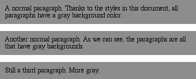
Figure 9-8. Backgrounds and padding
You can set a background color for just about any element, frombodyall the way down to inline elements such asemanda.background-coloris not inherited. Its default
value istransparent, which makes sense: if an
element doesn't have a defined color, then its background should be transparent so
that the background of its ancestor elements will be visible.
One way to picture the inheritance situation is to imagine a clear plastic sign
mounted to a textured wall. The wall is still visible through the sign, but this is
not the background of the sign, it's the background of the wall (in CSS terms,
anyway). Similarly, if you set the canvas to have a background, it can be seen
through all of the elements in the document that don't have their own backgrounds.
They don't inherit the background; it is visible
through
them.
This may seem like an irrelevant distinction, but as you'll see in the section on
background images, it's actually a critical difference.
Most of the time, you'll have no reason to use the keywordtransparentsince that's the default value. On occasion,
though, it can be useful. Imagine that a user has set his browser to make all links
have a white background. When you design your page, you set anchors to have a white
foreground, and you don't want a background on those anchors. To make sure your
design choice prevails, declare:
a {color: white; background-color: transparent;}
If you left out the background color, your white foreground would combine with the
user's white background to yield totally unreadable links. This is an unlikely
example, but it's still possible.
The potential combination of author and reader styles is the reason why a CSS
validator will generate warnings such as, "You have nobackground-colorwith yourcolor." It's trying to remind you that author-user color interaction
can occur, and your rule has not accounted for this possibility. Warnings do not
mean your styles are invalid: only errors prevent validation.
So, setting a background color is a pretty simple thing—except for one small
warning: Navigator 4 gets the placement of background colors completely wrong.
Instead of applying the background color to the entire content box and padding,
the color appears only behind the text itself, as shown in
Figure 9-9
.

Figure 9-9. Navigator 4.x's incorrect behavior
Let me reiterate:
this behavior is totally wrong
. To
counteract it, you must set a border on the element, which you can then set to the
same color as the background color of your document:
body {background: silver;}
p {background-color: gray; padding: 0.1px; border: 1px solid silver;}
Note that you must set aborder-stylefor
this technique to work. It doesn't matter whether you use that specific property
or simply a value of theborderproperty.
Of course, by doing this, you're setting a border on the element, and that
border will show up in other user agents as well. To top things off, Navigator
doesn't handle padding very well, so the previous example results in a small
amount of blank space between the content box and the borders. Thankfully, newer
browsers don't suffer from such problems.
effects
Simply by
combiningcolorandbackground-color, you can create some useful
effects:
h1 {color: white; background-color: rgb(20%,20%,20%);
font-family: Arial, sans-serif;}
This
example is illustrated in
Figure
9-10
.

Figure 9-10. A nifty effect for H1 elements
Of course, there are as many color combinations as there are colors,
but I can't show all of them here—being stuck in grayscale as we are. Still, I'll
try to give you some idea of what you can do.
This style sheet is a
little more complicated, as illustrated by
Figure
9-11
:
body {color: black; background-color: white;}
h1, h2 {color: yellow; background-color: rgb(0,51,0);}
p {color: #555;}
a:link {color: black; background-color: silver;}
a:visited {color: gray; background-color: white;}
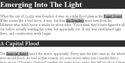
Figure 9-11. The results of a more complicated style sheet
This is just the tiniest beginning of what's possible, of course. By
all means, try some examples of your own!
Having covered the basics of foreground and background colors, we turn now to the
subject of background images.
In HTML
3.2, it was possible to associate an image with the background of the document by
using theBODYattributeBACKGROUND:
This caused a user agent to load the file
bg23.gif
and then
"tile" it in the document background, repeating it in both the horizontal and
vertical directions to fill the entire background of the document. This effect can be
duplicated in CSS, but CSS can do a great deal more than simple tiling
of background images.
We'll start with the basics and then work our way up.
image
To get an image
into the background in the first place, use the propertybackground-image.
background-image
- Values:
| none|inherit- Initial value:
none- Applies to:
All elements
- Inherited:
No
- Computed value:
Absolute URI
The default value ofnonemeans
about what you'd expect: no image is placed in the background. If you want a
background image, you must give this property a URL
value:
body {background-image: url(bg23.gif);}
Due
to the default values of other background properties, this will tile the image
bg23.gif
in the document's background, as shown in
Figure 9-12
. As you'll discover shortly,
though, tiling isn't the only option.
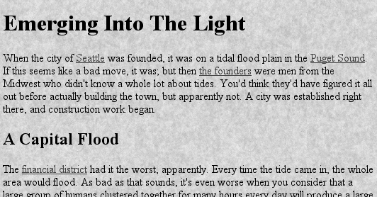
Figure 9-12. Applying a background image in CSS
It's usually a good idea to specify a background color to go along with your
background image; we'll come back to that concept a little later in the
chapter.
You can apply a background image to any element, block-level or inline.
Most backgrounds are applied tobodyelements,
of course, but there's no need to stop
there:
p.starry {background-image: url(http://www.site.web/pix/stars.gif);
color: white;}
a.grid {background-image: url(smallgrid.gif);}
It's the end of autumn, which means the stars will be
brighter than ever!  Join us for
a fabulous evening of planets, stars, nebulae, and more...
As
you can see in
Figure 9-13
, you've
applied a background to a single paragraph and no other part of the document. You
can customize even further, such as placing background images on inline elements
like hyperlinks, also depicted in
Figure
9-13
. Of course, if you want to be able to see the tiling pattern, the
image will probably need to be pretty small. After all, individual letters aren't
that large!

Figure 9-13. Applying background images to block and inline elements
There are a number of ways to employ specific background images. You
might place an image in the background ofstrongelements to make them stand out more. You could fill in the
background of headings with a wavy pattern or with little dots. You can even fill
in the cells of tables with patterns to distinguish them from the rest of the
page, as shown in
Figure
9-14
:
td.nav {background-image: url(darkgrid.gif);}
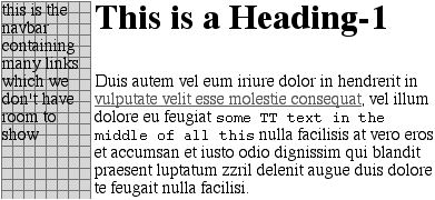
Figure 9-14. Setting a background image for a table cell
You could even, in theory, apply images to the background of replaced
elements such astextareas andselectlists, although not every user agent is good
at handling that sort of thing.
As withbackground-color,background-imageis not inherited—in fact, none of the background
properties are inherited. Remember also that specifying the URL of a background
image falls under the usual restrictions and caveats forurlvalues: a relative URL should be interpreted with respect to the
style sheet, but Navigator 4.x doesn't do this correctly, so absolute URLs may be
a better answer.
Earlier, I specifically noted that backgrounds are not
inherited. Background images demonstrate why inherited backgrounds would be a bad
thing. Imagine a situation where backgrounds were inherited, and you applied a
background image to thebody. That image would
be used for the background of every element in the document, with each element
doing its own tiling, as shown in
Figure
9-15
.
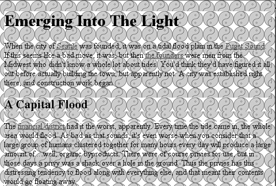
Figure 9-15. What inherited backgrounds would do to layout
Note how the pattern restarted at the top left of every element, including the
links. This isn't what most authors would want, so this is why background
properties are not inherited. If you
do
want this particular
effect for some reason, you can create it with a rule like this:
* {background-image: url(yinyang.gif);}
Alternatively, you could use the valueinheritlike this:
body {background-image: url(yinyang.gif);}
* {background-image: inherit;}
practices
Images are laid on top of whatever background
color you specify. If you're completely tiling GIF, JPEG, or other opaque image
types, this fact doesn't really make a difference, since a fully tiled image will
fill up the document background, leaving nowhere for the color to "peek through,"
so to speak. However, image formats with an alpha channel, such as PNG, can be
partially or wholly transparent, and this will cause the image to be combined with
the background color. In addition, if the image fails to load for some reason, the
user agent will use the specified background color in place of the image. Consider
how the "starry paragraph" example would look if the background image failed to
load, as in
Figure 9-16
.

Figure 9-16. The consequences of a missing background image
Figure 9-16
demonstrates why it's
always a good idea to specify a background color when using a background image, so
that you'll at least get a legible
result:
p.starry {background-image: url(http://www.site.web/pix/stars.gif);
background-color: black; color: white;}
a.grid {background-image: url(smallgrid.gif);}
It's the end of autumn, which means the stars will be
brighter than ever!  Join us for
a fabulous evening of planets, stars, nebulae, and more...
This
will fill in a flat black background if the "starry" image can't be rendered for
some reason. Besides, if you don't want the image to fully tile across the
background of the document, you'll need a color to cover the parts that the image
doesn't. Speaking of which . . . .