CSS: The Definitive Guide, 3rd Edition (36 page)
Read CSS: The Definitive Guide, 3rd Edition Online
Authors: Eric A. Meyer
Tags: #COMPUTERS / Web / Page Design
Unfortunately, shorthand properties such asborder-colorandborder-stylearen't always as helpful as you'd think. For example, you
might want to apply a thick, gray, solid border to allh1elements, but only along the bottom. If you limit yourself to the
properties we've discussed so far, you'll have a hard time applying such a border.
Here are two examples:
h1 {border-bottom-width: thick;   /* option #1 */
border-bottom-style: solid;
border-bottom-color: gray;}
h1 {border-width: 0 0 thick;     /* option #2 */
border-style: none none solid;
border-color: gray;}
Neither is really convenient, given all the typing involved. Fortunately, there's
a better solution:
h1 {border-bottom: thick solid gray;}
This applies the values to the bottom border alone, as shown in
Figure 8-31
, leaving the others to their
defaults. Since the default border style isnone,
no borders appear on the other three sides of the element.
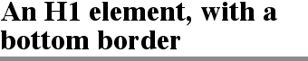
Figure 8-31. Setting a bottom border with a shorthand property
As you may have already guessed, there are a total of four such shorthand
properties.
border-top, border-right, border-bottom, border-left
- Values:
[
|| ||
] |inherit- Initial value:
Not defined for shorthand properties
- Applies to:
All elements
- Inherited:
No
- Computed value:
See individual properties (
border-width, etc.)
It's possible to use these properties to create some complex borders, such as
those shown in
Figure 8-32
:
h1 {border-left: 3px solid gray;
border-right: black 0.25em dotted;
border-top: thick silver inset;
border-bottom: double rgb(33%,33%,33%) 10px;}

Figure 8-32. Very complex borders
As you can see, the order of the actual values doesn't really matter. The
following three rules yield exactly the same border effect:
h1 {border-bottom: 3px solid gray;}
h2 {border-bottom: solid gray 3px;}
h3 {border-bottom: 3px gray solid;}
You can also leave out some values and let their defaults kick in, like this:
h3 {color: gray; border-bottom: 3px solid;}
Since no border color is declared, the default value (the element's foreground) is
applied instead. Just remember that if you leave out a border style, the default
value ofnonewill prevent your border from
existing.
By contrast, if you set only a style, you will still get a border. Let's say you
simply want a top border style ofdashed,and
you're willing to let the width default tomediumand the color be the same as the text of the element itself. All you need in such a
case is the following markup (shown in
Figure
8-33
):
p.roof {border-top: dashed;}
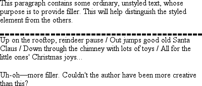
Figure 8-33. Dashing across the top of an element
Another thing to note is that since each of these "border-side" properties apply
only to a specific side, there isn't any possibility of value replication—it wouldn't
make any sense. There can be only one of each type of value: that is, only one width
value, only one color value, and only one border style. So don't try to declare more
than one value type:
h3 {border-top: thin thick solid purple;} /* two width values--WRONG */
In such a case, the entire statement will be invalid and a user agent would ignore
it altogether.
Now, we
come to the shortest shorthand border property
of all:border.
border
- Values:
[
|| ||
] |inherit- Initial value:
Refer to individual properties
- Applies to:
All elements
- Inherited:
No
- Computed value:
As specified
This property has the advantage of being very compact, although that brevity
introduces a few limitations. Before we worry about that, let's see howborderworks. If you want allh1elements to have a thick, silver border, it's very simple. This
declaration would be displayed as shown in
Figure 8-34
:
h1 {border: thick silver solid;}

Figure 8-34. A really short border declaration
The values are applied to all four sides. This is certainly preferable to the
next-best alternative, which would be:
h1 {border-top: thick silver solid;
border-bottom: thick silver solid;
border-right: thick silver solid;
border-left: thick silver solid;}  /* same as previous example */
The drawback withborderis that you can define
only "global" styles, widths, and colors. In other words, the values you supply forborderwill apply to all four sides equally. If
you want the borders to be different for a single element, you'll need to use some of
the other border properties. Of course, it's possible to turn the cascade to your
advantage:
H1 {border: thick silver solid;
border-left-width: 20px;}
The second rule overrides the width value for the left border assigned by the
first rule, thus replacingthickwith20px, as you can see in
Figure 8-35
.

Figure 8-35. Using the cascade to one's advantage
You still need to take the usual precautions with shorthand properties: if you
omit a value, the default will be filled in automatically, which can have unintended
effects. Consider the following:
h4 {border-style: dashed solid double;}
h4 {border: medium green;}
Here, you've failed to assign a border-style in the second rule, which means that
the default value ofnonewill be used, and noh4elements will have any border at all.
Dealing with borders and inline elements should sound
pretty familiar since the rules are largely the same as those for margins and inline
elements, as well as for material covered in
Chapter
7
. Still, I'll briefly touch on the topic again.
First, no matter how thick you make your borders on inline elements, the line
height of
the element won't change. Let's set top and bottom borders on boldfaced text:
strong {border-top: 10px solid gray; border-bottom: 5px solid silver;}
Once more, this syntax is allowed in the specification, but it will have
absolutely no effect on the line height. However, since borders are visible, they'll
be drawn—as you can see for yourself in
Figure
8-36
.
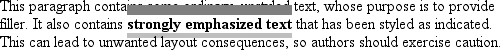
Figure 8-36. Borders on inline nonreplaced elements
The borders had to go somewhere; that's where they went.
Again, all of this is true only for the top and bottom sides of inline elements;
the left and right sides are a different story. If you apply a left or right border,
not only will it be visible, but it will displace the text around it, as you can see
in
Figure 8-37
:
strong {border-left: 25px double gray; background: silver;}
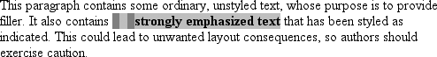
Figure 8-37. An inline nonreplaced element with a left border
With borders, just as with margins, the browser's calculations for line-breaking
are not directly affected by any box properties set for inline elements. The only
effect is that the space occupied by the borders may shift portions of the line over
a bit, which may in turn change which word is at the end of the line.
There are very few compatibility problems with CSS borders. The most
distressing is the fact that Navigator 4.x won't draw a border around the
padding
area of a block-level element but
instead inserts some space between the padding and the border. Speaking of
Navigator 4.x, it is extremely dangerous to set borders—or any other box
properties—on inline elements. This is as true for borders as it is for margins,
and for much the same reasons (which were noted earlier in the chapter).