CSS: The Definitive Guide, 3rd Edition (32 page)
Read CSS: The Definitive Guide, 3rd Edition Online
Authors: Eric A. Meyer
Tags: #COMPUTERS / Web / Page Design
Although some aspects of the CSS formatting model may seem counterintuitive at first,
they begin to make sense as you work with them more. In many cases, rules that initially
seem nonsensical or even idiotic turn out to prevent bizarre or otherwise undesirable
document displays. Block-level elements are in many ways easy to understand, and
affecting their layout is typically a simple task. Inline elements, on the other hand,
can be tricky to manage, as a number of factors come into play—not least of which is
whether the element is replaced or nonreplaced. Now that we've established the
underpinnings of document layout, let's turn our attention to how the various layout
properties are used. This effort will span several chapters, and we'll start with the
most common box properties: padding, borders, and margins.
If you're like the vast majority of web designers who were working in the late 1990s,
your pages all use tables for layout. You design them this way, of course, because tables
can be used to create sidebars and to set up a complicated structure for an entire page's
appearance. You might even use tables for simpler tasks, like putting text in a colored box
with a border. When you think about it, though, you shouldn't need a table for such simple
tasks. If you want only a paragraph with a red border and a yellow background, shouldn't
creating it be easier than wrapping a single-cell table around it?
The authors of CSS felt it should indeed be easier, so they devoted a great deal of
attention to allowing you to define borders for paragraphs, headings,divs, anchors, images—darned near everything a web page can
contain. These borders can set an element apart from others, accentuate its appearance,
mark certain kinds of data as having been changed, or any number of other things.
CSS also lets you define regions around an element that control how the border is placed
in relation to the content and how close other elements can get to that border. Between the
content of an element and its border, we find the
padding
of an element, and beyond the border, the
margins
. These properties affect how the entire document is laid
out, of course, but more importantly, they very deeply affect the appearance of a given
element.
As we discussed in
Chapter 7
, all document
elements generate a rectangular box called the
element box
, which
describes the amount of space that an element occupies in the layout of the document.
Therefore, each box influences the position and size of other element boxes.
For example, if the first element box in the document is
an inch tall, the next box will begin at least an inch below the top of the document. If
the first element box is changed to two inches tall, every following element box will
shift downward an inch, and the second element box will begin at least two inches below
the top of the document, as shown in
Figure
8-1
.
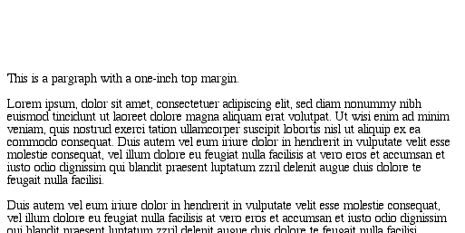
Figure 8-1. How one element affects all elements
By default, a visually rendered document is composed of a number of rectangular boxes
that are distributed such that they don't overlap one another. Also, within certain
constraints, these boxes take up as little space as possible, while maintaining a
sufficient separation to make clear which content belongs to which element.
Boxes can overlap if they have been manually positioned, and visual overlap can
occur if negative margins are used on normal-flow elements.
To fully understand how margins, padding, and borders are handled, you must clearly
understand the box model (also explained in
Chapter
7
). For reference, I'll include the box model diagram from that chapter (see
Figure 8-2
).
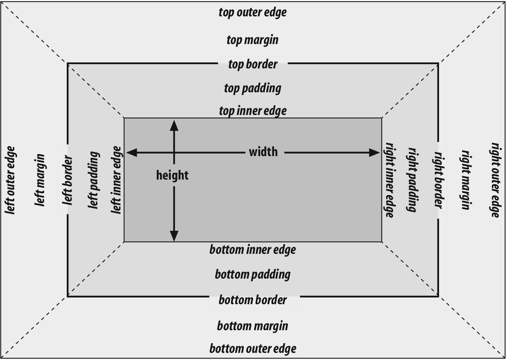
Figure 8-2. The CSS box model
As
Figure 8-2
illustrates, thewidthof an element is defined as the distance from the
left inner edge to the right inner edge, and theheightis the distance from the inner top to the inner bottom.
One important note about these two properties: they don't apply to
inline
nonreplaced
elements. For
example, if you try to declare aheightandwidthfor a hyperlink, CSS-conformant browsers
must ignore those declarations. Assume that the following rule applies:
a:link {color: red; background: silver; height: 15px; width: 60px;}
You'll end up with red links on a silver background whose height and width are
determined by the content of the links. They will
not
be 15
pixels tall by 60 pixels wide.
width
- Values:
| | auto|inherit- Initial value:
auto- Applies to:
Block-level and replaced elements
- Inherited:
No
- Percentages:
Refer to the width of the containing block
- Computed value:
For
autoand percentage values, as
specified; otherwise, an absolute length, unless the property does not
apply to the element (thenauto)
height
- Values:
| |auto inherit- Initial value:
auto- Applies to:
Block-level and replaced elements
- Inherited:
No
- Percentages:
Calculated with respect to the height of the containing block
- Computed value:
For
autoand percentage values, as
specified; otherwise, an absolute length, unless the property does not
apply to the element (thenauto)
In the course of this chapter, we'll keep the discussion simple by assuming that
the height of an element is always calculated automatically. If an element is eight
lines long, and each line is an eighth of an inch tall, then the height of the
element is one inch. If it's 10 lines tall, then the height is 1.25 inches. In either
case, the height is determined by the content of the element, not by the author. It's
rarely the case that elements in the normal flow have a set height.
Historical Problems
Prior to Version 6, Internet Explorer for Windows did not act as CSS stipulates
with regard towidthandheight. The two major differences are:
IE/Win used
widthandheightto define the dimensions of the visible
element box, not the content of the element box. If you defined an element
to have awidthof400px, IE/Win would make the distance from the
left outer border edge to the right outer border edge 400 pixels. In other
words, IE/Win usedwidthto describe the
total of the element's content area, left and right padding, and left and
right border. CSS3 includes proposals to let the author decide whatwidthandheightmean.IE/Win applied
widthandheightto inline nonreplaced elements. For
example, if you appliedwidthandheightto a hyperlink, it would be
drawn according to the supplied values.
Both of these behaviors were fixed in IE6, but only in "standards" mode. If IE6
renders a document in "quirks" mode, it will still use the previously described
behaviors.
Element boxes provide only small amounts of space
between elements. There are three ways to generate additional space around elements:
you can add padding, margins, or a combination of padding and margins. Under certain
circumstances, the choice doesn't really matter. If an element has a background,
however, your decision is already made, because the background will extend into the
padding but not the margin.
Thus, the amount of padding and margin you assign to a given element will
influence where the background of the element will end. If you set background colors
for the elements involved, as illustrated in
Figure 8-3
, the difference becomes clear. The elements with padding have
extra background, as it were, whereas those with margins do not.
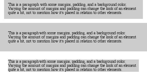
Figure 8-3. Paragraphs with different margins and padding, with backgrounds to illustrate
the differences
In the end, deciding how to set margins and padding is up to the designer, who
must weigh the various possibilities against the intended effect and pick the best
alternative. To make these choices, of course, it helps to know which properties you
can use.
The separation between most normal-flow elements
occurs because of element margins. Setting a margin creates extra "blank space" around
an element. "Blank space" generally refers to an area in which other elements cannot
also exist and in which the parent element's background is visible. For example,
Figure 8-4
shows the difference between two
paragraphs without any margins, and the same two paragraphs with margins.
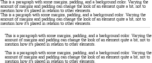
Figure 8-4. Paragraphs with and without margins
The simplest way to set a margin is by using the propertymargin.
margin
- Values:
[
| | auto]{1,4} |inherit- Initial value:
Not defined
- Applies to:
All elements
- Inherited:
No
- Percentages:
Refer to the width of the containing block
- Computed value:
See individual properties
The effects of settingautomargins were discussed
in detail in
Chapter 7
, so we won't repeat them
here. Besides, it's more common to set length values for margins. Suppose you want to
set a quarter-inch margin onh1elements, as
illustrated in
Figure 8-5
. (A background
color has been added so you can clearly see the edges of the content area.)
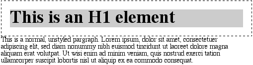
Figure 8-5. Setting a margin for h1 elements
h1 {margin: 0.25in; background-color: silver;}
This sets a quarter-inch of blank space on each side of anh1element. In
Figure 8-5
,
dashed lines represent the blank space, but the lines are purely illustrative and would
not actually appear in a web browser.
margincan accept any length of measurement, whether
in pixels, inches, millimeters, or ems. However, the default value formarginis effectively0(zero), so if you don't declare a value, no margin should appear.
In practice, however, browsers come with preassigned styles for many elements, and
margins are no exception. For example, in CSS-enabled browsers, margins generate the
"blank line" above and below each paragraph element. Therefore, if you don't declare
margins for thepelement, the browser may apply some
margins on its own. Whatever you declare will override the default styles, of course.
Finally, it's possible to set a percentage value formargin. The details of this value type will be discussed in the upcoming
section "
Percentages and Margins
."
As stated
before, any length value can be used in setting the margins of an element. It's
simple enough, for example, to apply a 10-pixel whitespace around paragraph elements.
The following rule gives paragraphs a silver background and a 10-pixel margin, as
shown in
Figure 8-6
:
p {background-color: silver; margin: 10px;}
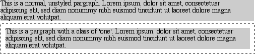
Figure 8-6. Comparative paragraphs
(Again, the background color helps show the content area, and the dashed lines are
for illustrative purposes only.) As
Figure
8-6
demonstrates, 10 pixels of space have been added to each side of the
content area. The result is somewhat similar to using thehspaceandvspaceattributes in
HTML. In fact, you can usemarginto set extra
space around an image. Let's say you want one em of space surrounding all images:
img {margin: 1em;}
That's all it takes.
At times, you might prefer a different amount of space on each side of an element.
That's simple as well. If you want allh1elements
to have a top margin of 10 pixels, a right margin of 20 pixels, a bottom margin of 15
pixels, and a left margin of 5 pixels, here's all you need:
h1 {margin: 10px 20px 15px 5px;}
The order of the values is important, and follows this pattern:
margin:top right bottom left
A good way to remember this pattern is to keep in mind that the four values go
clockwise around the element, starting from the top. The values are
always
applied in this order, so to get the effect you want, you
have to arrange them correctly.
Another easy way to remember the order in which sides must be declared is to
keep in mind that getting the sides in the correct order helps you avoid
"TRouBLe"—that is,
TRBL
, for "
T
op
R
ight
B
ottom
L
eft."
It's also possible to mix up the types of length value you use. You aren't
restricted to using a single length type in a given rule, as shown here:
h2 {margin: 14px 5em 0.1in 3ex;} /* value variety! */
Figure 8-7
shows you, with a little extra
annotation, the results of this declaration.
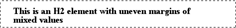
Figure 8-7. Mixed-value margins
As I mentioned earlier, it's possible to set percentage values for
the
margins of an element. Percentages are computed in relation to the width of the
parent element, so they change if the parent element's width changes in some way. For
example, assume the following, which is illustrated in
Figure 8-8
:
p {margin: 10%;}

This paragraph is contained within a DIV that has a width of 200 pixels,
so its margin will be 10% of the width of the paragraph's parent (the DIV).
Given the declared width of 200 pixels, the margin will be 20 pixels on
all sides.


This paragraph is contained within a DIV with a width of 100 pixels,
so its margin will still be 10% of the width of the paragraph's parent.
There will, therefore, be half as much margin on this paragraph as that
on the first paragraph.
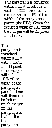
Figure 8-8. Parent widths and percentages
By contrast, consider the case of elements without a declaredwidth. In such cases, the overall width of the element
box (including margins) is dependent on thewidthof the parent element. This leads to the possibility of "fluid" pages, where the
margins of elements enlarge or reduce to match the actual size of the parent element
(or display canvas). If you style a document so that its elements use percentage
margins, the margins will expand or shrink to fit as the user changes the width of a
browser window. The design choice is up to you.
You may have noticed something odd about the paragraphs in
Figure 8-8
. Not only did their side margins
change according to the width of their parent elements, but so did their top and
bottom margins. That's the desired behavior in CSS. Refer back to the property
definition, and you'll see that percentage values are defined to be relative to the
width
of the parent element. This applies to the top and
bottom margins, as well as to the left and right. Thus, given the following styles
and markup, the top margin of the paragraph will be50px:
div p {margin-top: 10%;}

This is a paragraph, and its top margin is 10% the width of its parent
element.
If thewidthof thedivchanges, the top margin of the paragraph will, too. Seem strange?
Consider that most elements in the normal flow are (as we are assuming) as tall as
necessary to contain their descendant elements, including margins. If an element's
top and bottom margins were a percentage of the parent, an infinite loop could result
where the parent's height was increased to accommodate the top and bottom margins,
which would then have to increase to match the new height, and so on. Rather than
simply ignore percentages for top and bottom margins, the specification authors
decided to make it relate to the width of the parent, which does not change based on
the width of its descendants.
The treatment of percentage values for top and bottom margins is different for
positioned elements; see
Chapter 10
for more
details.
It's also possible to mix percentages with length values. Thus, to seth1elements to have top and bottom margins of one-half
em, and side margins that are 10 percent of the width of the browser window, you can
declare the following, illustrated in
Figure
8-9
:
h1 {margin: 0.5em 10% 0.5em 10%;}
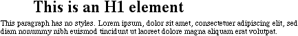
Figure 8-9. Mixed margins
Here, although the top and bottom margins will stay constant in any situation, the
side margins will change based on the width of the browser window. Of course, we're
assuming that allh1elements are children of thebodyelement and thatbodyis as wide as the browser window. Plainly stated, the side margins
ofh1elements will be 10 percent of the width of
theh1's parent element.
Let's revisit that rule for a moment:
h1 {margin: 0.5em 10% 0.5em 10%;}
Seems a little redundant, doesn't it? After all, you have to type in the same pair
of values twice. Fortunately, CSS offers an easy way to avoid this.