CSS: The Definitive Guide, 3rd Edition (27 page)
Read CSS: The Definitive Guide, 3rd Edition Online
Authors: Eric A. Meyer
Tags: #COMPUTERS / Web / Page Design
margins
Negative margins do have an impact on vertical
formatting, and they affect how margins are collapsed. If negative vertical
margins are set, then the browser should take the absolute maximum of both
margins. The absolute value of the negative margin is then subtracted from the
positive margin. In other words, the negative is added to the positive, and the
resulting value is the distance between the elements.
Figure 7-21
provides two concrete
examples.
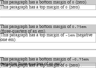
Figure 7-21. Examples of negative vertical margins
Notice the "pulling" effect of negative top and bottom margins. This
is really no different from the way that negative horizontal margins cause an
element to push outside of its parent.
Consider:
p.neg {margin-top: -50px; margin-right: 10px;
margin-left: 10px; margin-bottom: 0;
border: 3px solid gray;}


A paragraph.

A div.
As
you see in
Figure 7-22
, the paragraph
has simply been pulled upward by its negative top margin. Note that the content of
thedivthat follows the paragraph in the
markup has also been pulled upward 50 pixels.
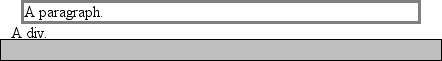
Figure 7-22. The effects of a negative top margin
The negative bottom margin makes the paragraph look like it's been
pulled upward. Compare the following markup to the situation depicted in
Figure
7-23
:
p.neg {margin-bottom: -50px; margin-right: 10px;
margin-left: 10px; margin-top: 0;
border: 3px solid gray;}


A paragraph.


The next paragraph.

Figure 7-23. The effects of a negative bottom margin
What's really happening in
Figure
7-23
is that the elements following thedivare placed according to the location of the bottom of thediv. As you can see, the end of thedivis actually above the visual bottom of its child
paragraph. The next element after thedivis
the appropriate distance from the bottom of thediv. This is expected, given the rules you used.
Now let's
consider an example where the margins of a list item, an unordered list, and a
paragraph are all collapsed. In this case, the unordered list and paragraph are
assigned negative
margins:
li {margin-bottom: 20px;}
ul {margin-bottom: -15px;}
h1 {margin-top: -18px;}
The
larger of the two negative margins (-18px) is
added to the largest positive margin (20px),
yielding 20px - 18px = 2px. Thus, there are only two pixels between the bottom of
the list item's content and the top of theh1's
content, as you can see in
Figure
7-24
.
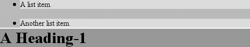
Figure 7-24. Collapsing margins and negative margins, in detail
One area of unresolved behavior is that if elements overlap each other
due to negative margins, it's hard to tell which elements are on top. You may also
have noticed that none of the examples in this section use background colors. If
they did, their content might be overwritten by the background color of a
following element. This is expected behavior since browsers usually render
elements in order from beginning to end, so a normal-flow element that comes later
in the document can be expected to overwrite an earlier element, assuming the two
end up overlapping.
List items have a few special rules of their own.
They are typically preceded by a marker, such as a small dot or a number. This marker
isn't actually part of the list item's content area, so effects like those
illustrated in
Figure 7-25
are common.
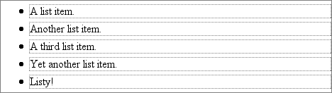
Figure 7-25. The content of list items
CSS1 says very little about the placement and effects of these markers with regard
to a document's layout. CSS2 introduced properties specifically designed to address
this issue, such asmarker-offset. However,
changes in thinking and a lack of implementations caused this to be dropped from
CSS2.1, and it is likely that future versions of CSS will introduce a different way
of defining the distance between the content and the marker. Therefore, the placement
of markers is largely beyond the control of authors (at least as of this writing).
For a more detailed exploration of lists and how they can be styled, see
Chapter 12
.
The marker attached to a list item element can be either outside the content of
the list item or treated as an inline marker at the beginning of the content,
depending on the value of the propertylist-style-position. If the marker is brought inside, then the list item
will interact with its neighbors exactly like a block-level element, as illustrated
in
Figure 7-26
.
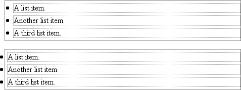
Figure 7-26. Markers inside and outside the list
If the marker stays outside the content, it is placed some distance from the left
content edge of the content (in left-to-right languages). No matter how the list's
styles are altered, the marker stays the same distance from the content edge.
Occasionally, the markers may be pushed outside of the list element itself, as you
can see in
Figure 7-26
.
After block-level elements, inline elements are the most common. Setting box
properties for inline elements takes us into more interesting territory than we've
visited so far. Some good examples of inline elements are theemtag and theatag, both of which are
nonreplaced elements, and images, which are replaced elements.
None of the behavior described in this section applies to table elements. CSS2
introduced new properties and behaviors for handling tables and table content, and
these elements behave in ways fairly distinct from either block-level or inline
formatting. Table styling is discussed in
Chapter
11
.
Nonreplaced and replaced elements are treated somewhat differently in the inline
context, and we'll look at each in turn as we explore the construction of inline
elements.
First, you need to understand how inline content is laid out. It isn't as simple
and straightforward as block-level elements, which just generate boxes and usually
don't allow anything to coexist with them. By contrast, look
inside
a block-level element, such as a paragraph. You may well
ask, "How did all those lines of text get there? What controls their arrangement? How
can I affect it?"
To understand how lines are generated, first consider the case of an element
containing one very long line of text, as shown in
Figure 7-27
. Note that you've put a border
around the line by wrapping the entire line in aspanelement and then assigning it a border style:
span {border: 1px dashed black;}

Figure 7-27. A single-line inline element
Figure 7-27
shows the simplest case of an
inline element contained by a block-level element. It's no different, in its own way,
than a paragraph with two words in it. The only differences are that, in
Figure 7-27
, you have a few dozen words and
most paragraphs don't contain an explicit inline element such asspan.
To get from this simplified state to something more familiar, all you have to do
is determine how wide the element should be, and then break up the line so that the
resulting pieces will fit into the width of the element. Therefore, we arrive at the
state shown in
Figure 7-28
.
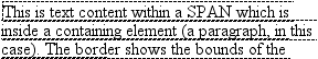
Figure 7-28. A multiple-line inline element
Nothing has really changed. All you did was take the single line and break it into
pieces, and then stack those pieces on top of one another.
In
Figure 7-28
, the borders for each
line of text also happen to coincide with the top and bottom of each line. This is
true only because no padding or margin has been set for the inline text. Notice that
the borders actually overlap each other slightly; for example, the bottom border of
the first line is just below the top border of the second line. This is because the
border is actually drawn on the next pixel (assuming you're using a monitor) to the
outside
of each line. Since the lines are touching each
other, their borders will overlap, as shown in
Figure 7-28
.
If you alter thespanstyles to have a
background color, the actual placement of the lines becomes quite clear. Consider
Figure 7-29
, which contains four
paragraphs, each with a different value oftext-alignand each having the backgrounds of its lines filled in.
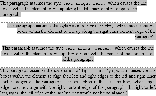
Figure 7-29. Showing lines in different alignments
As you can see, not every line reaches to the edge of its parent paragraph's
content area, which has been denoted with a dotted gray border. For the left-aligned
paragraph, the lines are all pushed flush against the left content edge of the
paragraph, and each line ends wherever the line is broken. The reverse is true for
the right-aligned paragraph. For the centered paragraph, the centers of the lines are
aligned with the center of the paragraph. In the last case, where the value oftext-alignisjustify, each line is forced to be as wide as the paragraph's content
area, so that the line's edges touch the content edges of the paragraph. The
difference between the natural length of the line and the width of the paragraph is
made up by altering the spacing between letters and words in each line. Therefore,
the value ofword-spacingcan be overridden when
text is justified. (The value ofletter-spacingcannot be overridden if it is a length value.)
That pretty well covers how lines are generated in the simplest cases. As you're
about to see, however, the inline formatting model is far from simple.
Before we
go any further, let's review some basic terms of inline layout, which will be crucial
in navigating the following sections:
- Anonymous text
This is any string of characters that is not contained within an inline
element. Thus, in the markupI'm
so happy!
and " happy!" are anonymous text. Note that the spaces are part of the text
since a space is a character like any other.- Em box
This is defined in the given font, otherwise known as the character box.
Actual glyphs can be taller or shorter than their em boxes, as discussed in
Chapter 5
. In CSS, the value offont-sizedetermines the height of
each em box.- Content area
In nonreplaced elements, the content area can be one of two things, and
the CSS2.1 specification allows user agents to choose which one. The content
area can be the box described by the em boxes of every character in the
element strung together, or it can be the box described by the character
glyphs in the element. In this book, I use the em box definition for
simplicity's sake. In replaced elements, the content area is the intrinsic
height of the element plus any margins, borders, or padding.- Leading
The leading is the difference between the values of
font-sizeandline-height. This difference is actually divided in half and
applied to the top and bottom of the content area. These additions to the
content area are called, not surprisingly, half-leading. Leading is applied
only to nonreplaced elements.- Inline box
This is the box described by the addition of the leading to the content
area. For nonreplaced elements, the height of the inline box of an element
will be exactly equal to the value forline-height. For replaced elements, the height of the inline box
of an element will be exactly equal to the content area since leading is not
applied to replaced elements.- Line box
This is the shortest box that bounds the highest and lowest points of the
inline boxes
that
are found in the line. In other words, the top edge of the line box is
placed along the top of the highest inline box top, and the bottom of the
line box is placed along the bottom of the lowest inline box bottom.
CSS also contains a set of behaviors and useful concepts that emerge from the list
of terms and definitions just described:
The content area is analogous to the content box of a block-level
element.The background of an inline element is applied to the content area plus any
padding.Any border on an inline element surrounds the content area plus any padding
and borders.Padding, borders, and margins on nonreplaced elements have no vertical
effect on inline elements or the boxes they generate; that is, they do
not
affect the height of an element's inline box (and
thus the line box that contains the element).Margins and borders on replaced elements
do
affect the
height of the inline box for that element and, by implication, the height of
the line box for the line containing the element.
One more thing to note: inline boxes are vertically aligned within the line
according to their values for the propertyvertical-align. I touched on this point in
Chapter 6
, and this chapter will explain it in more depth.
Before moving on, let's look at a step-by-step process for constructing a line
box, which you can use to see how the various pieces of the line fit together to
determine its height:
Determine the height of the inline box for each element in the line by
following these steps:Find the values of
font-sizeandline-heightfor each inline
nonreplaced element and any text that is not part of a descendant inline
element. Then combine them by subtracting thefont-sizefrom theline-height, which yields the leading for the box. The leading
is split in half and applied to the top and bottom of the em
boxes.Find the values of
height,margin-top,margin-bottom,padding-top,padding-bottom,border-top-width, andborder-bottom-widthfor each replaced element and add them
together.
For each content area, determine how much of it is above the baseline for
the overall line and how much of it is below the baseline. This is not an easy
task: you must know the position of the baseline for each element and piece of
anonymous text, and the baseline of the line itself; then you must line them
all up. In addition, the bottom edge of a replaced element sits on the baseline
for the overall line.Determine the vertical offset of any elements that have been given a value
forvertical-align. This will tell you how
far up or down that element's inline box will be moved, and will change how
much of the element is above or below the baseline.Now that you know where all of the inline boxes have come to rest, calculate
the final line box height. To do so, just add the distance between the baseline
and the highest inline box top to the distance between the baseline and the
lowest inline box bottom.
Let's consider the whole process in detail, which is key to intelligently styling
inline content.