CSS: The Definitive Guide, 3rd Edition (62 page)
Read CSS: The Definitive Guide, 3rd Edition Online
Authors: Eric A. Meyer
Tags: #COMPUTERS / Web / Page Design
Thanks to user interface styles, it's possible for an author to make a document look
more like the user's computing environment, especially with a creative use of system
color and fonts. By reusing things with which the user is already familiar, a document
can seem more familiar and user-friendly from the outset.
Another way to make users' lives a little easier is to create style sheets that are
targeted at media other than their monitors. This would include styles intended
specifically for printing, aural (spoken) access of a web page, and even for a
projection-screen environment. We'll cover all of those in the next chapter.
Not everyone who accesses the Web can see the effects we've discussed in this book. Some
1.1 million people in the United States are blind, and they have a very different
experience of the Web than sighted persons.
Fortunately, CSS is not silent on the matter of non-visual access. CSS2 included the
ability to apply styles in nonlo-screen media. While most of the Web's evolution has taken
place on monitors—that is to say, in a visual medium—CSS2 can be used in non-visual media,
assuming that the user agent has proper support.
The advantages of designing documents that are at once visually and non-visually usable
should not be dismissed. If you can take one document and use different, medium-specific
style sheets
to restyle it for
screen, print, and aural rendering, you can save yourself a whole lot of trouble. For
example, you wouldn't need to link to "printer-friendly" versions of a page. Instead of
creating totally different markup structures, one for screen and another for print, you can
make your site more efficient by reusing the same document.
For that matter, it's possible to take a single HTML document that contains the outline
of a slideshow and style it for easy reading on a screen, for clean and readable printouts,
as a slideshow, and in a manner that a screen reader can translate. In the course of this
chapter, we'll look at ways to do the latter three (since the rest of the book concerns
itself with screen presentation).
You can restrict any kind of style sheet
to a specific medium, thanks to the mechanisms defined in HTML and CSS. For HTML-based
style sheets, you can impose medium restrictions through themediaattribute. This works the same for both thelinkandstyleelements:
href="article-print.css">
Themediaattribute can accept a single medium
value or a comma-separated list of values. Thus, to link in a style sheet that should be
used in only the screen and projection media, you would write:
href="visual.css">
In a style sheet itself, you can also impose medium restrictions on@importrules:
@import url(visual.css) screen, projection;
@import url(article-print.css) print;
Remember that if you don't add medium information to a style sheet, it will be
applied in
all
media. Therefore, if you want one set of styles to
apply only onscreen, and another to apply only in print, then you need to add medium
information to both style sheets. For example:
href="article-screen.css">
href="article-print.css">
If you were to remove themediaattribute from the
firstlinkelement in the preceding example, the
rules found in the style sheet
article-screen.css
would be applied
in all media, including print, projection, handheld, and everything else.
CSS2 also defines syntax for@mediablocks, which
lets you define styles for multiple media within the same style sheet. Consider this
basic example:
Here you see that in all media, thebodyelement
is given a white background and a black foreground. Then a block of rules is provided
for thescreenmedium alone, followed by another
block of rules that applies only in theprintmedium.
@mediablocks can be any size and contain any number
of rules. In situations where authors may have control over a single style sheet,@mediablocks may be the only way to define
medium-specific styles. This is also the case in situations where CSS is used to style a
document using an XML language that does not contain amediaattribute or its equivalent.
In CSS terms, a
paged medium
is any medium where a document's
presentation is handled as a series of discrete "pages." This is different from the
screen, which is a
continuous medium
:
documents are presented as a single, scrollable
"page." An analog example of a continuous medium is a papyrus scroll. Printed material,
such as books, magazines, and laser printouts, are all paged media.
So are slideshows, where a series of slides is shown one
at a time. Each slide is a "page" in CSS terms.
Even in the
"paperless future,"
the most
commonly encountered paged medium is a printout of some document—a web page, a
word-processing document, a spreadsheet, or something else that has been committed to
the thin wafers of a dead tree. Authors can do a number of things to make printouts
of their documents more pleasing for the user, from affecting page breaking to
creating styles meant specifically for print.
Note that print styles
would also be
applied to document display in a "print preview"
mode. Thus, it's possible in some circumstances to see
print styles on a monitor.
Beyond the obvious physical differences, there are a number of stylistic
differences between screen and print design. The most basic involves font choices.
Most designers will tell you that sans-serif fonts are best suited for screen
design,
but serif fonts are more readable in print. Thus,
you might set up a print style sheet that uses Times instead of Verdana for the
text in your document.
Another major difference involves font sizing. If you've spent any time at all
doing web design, you've probably heard again and again (and again) that points
are a horrible choice for font sizing on the Web. This is basically true,
especially if you want your text to be consistently sized between browsers and
operating systems. However, print design is not web design any more than web
design is print design. Using points, or even centimeters or picas, is perfectly
OK in print design because printing
devices know the physical size of their output area. If a printer has been loaded
with 8.5 × 11 paper, then it knows it has a printing area that will fit within the
edges of that piece of paper. It also knows how many dots there are in an inch,
since it knows how many dots-per-inch (dpi) it's capable of generating. This means
that it can cope with physical-world length units like points.
Therefore, many a print style sheet has started with:
body {font: 12pt "Times New Roman", "TimesNR", Times, serif;}
It's so traditional, it just might bring a tear of joy to the eye of a graphic
designer reading over your shoulder. But make sure he understands that points are
acceptable only because of the nature of the print medium—they're still not good
for web design.
Alternatively, the lack of backgrounds in most printouts might bring a tear of
frustration to that designer's eye. To save users ink, most web browsers are
preconfigured not to print background colors and images. If the user wants to see
those backgrounds in the printout, she must change an option somewhere in the
preferences. CSS can't do anything to force the printing of backgrounds. However,
you can use a print style sheet to make backgrounds unnecessary. For example, you
might include this rule in your print style sheet:
* {color: black !important; background: white !important;}
This will ensure that all of your elements will print out as black text and
remove any backgrounds you might have assigned in an all-medium style sheet. Since
this is how most users' printers will render the page anyway, you're better off
setting up your print styles along the same lines. If you have a web design that
puts yellow text on a dark gray background, this rule also makes sure that a user
with a color printer won't get yellow text on a white piece of paper.
CSS2.x does not include a mechanism for picking a style sheet based on the
user's output device. Thus, all printers will use the print style sheets you
define. The CSS3 Media Queries module defines ways to send a different style
sheet to color printers than to grayscale printers, but as of this writing,
support for media queries is basically nonexistent.
One other difference between paged media and continuous media is that
multicolumn layouts are even harder to use in paged media. Suppose you have an
article where the text has been formatted as two columns. In a printout, the left
side of each page will contain the first column, and the right side the second.
This would force the user to read the left side of every page, then go back to the
beginning of the printout and read the right side of every page. This is annoying
enough on the Web, but on paper it's much worse.
The obvious solution is to use CSS for laying out your two columns (by floating
them, perhaps) and then writing a print style sheet that restores the content to a
single column. Thus, you might write something like this for the screen style
sheet:
div#leftcol {float: left; width: 45%;}
div#rightcol {float: right; width: 45%;}
Then in your print style sheet, you would write:
div#leftcol, div#rightcol {float: none; width: auto;}
If CSS had a way to do multicolumn flowed layout, none of this would be
necessary. Sadly, although proposals have circulated for years, there is nothing
offered as of this writing.
We could spend an entire chapter on the details of print design, but that
really isn't the purpose of this book. Let's start exploring the details of
paged-media CSS and leave the design discussions for another book.
size
In
much the same way as it defines the element box, CSS2 defines a
page
box
that describes the components of a page. A page box is composed of
basically two regions:
The
page area
,
which is the portion of the page where the
content is laid out. This is roughly analogous to the content area of a
normal element box, to the extent that the edges of the page area act as the
initial containing block for layout within a page. (See
Chapter 7
for details on containing
blocks.)The
margin area
, which surrounds the page
area.
The page box model is illustrated in
Figure 14-1
.
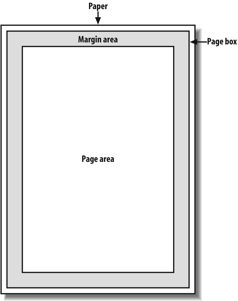
Figure 14-1. The page box
In CSS2, it was possible to define the size of the page box as well as
the margins. In CSS2.1, authors can set only the size of the margin area. In both
cases, the@pagerule is the method by which
settings are made. Here's a simple
example:
@page {size: 7.5in 10in; margin: 0.5in;}
This
is a CSS2 rule, as it uses the propertysize,
which was not included in CSS2.1 due to a lack of implementation
support.
size
- Values:
{1,2} | auto|portrait|landscape|inherit- Initial value:
auto- Applies to:
The page area
- Inherited:
No
This property is used to define the size of the page area. The valuelandscapecauses the layout to be rotated 90
degrees, whereasportraitis the normal
orientation for Western-language printing. Thus, an author could cause a document
to be printed "sideways" by
declaring:
@page {size: landscape;}
sizeis not part of CSS2.1, which means that,
as of its writing, no two interoperable implementations ofsizeare known to exist. So, browser support is
likely to be poor. CSS2.1 does include the ability to style the margin area of the
page box, which is likely to work more reliably. If you want to make sure that
only a small bit at the center of every 8.5 × 11 page would print, you could
write:
@page {margin: 3.75in;}
This
would leave a printing area one inch wide by three and a half inches
tall.
What's really interesting about the page box is that it doesn't
have any relationship to fonts, so you can't use the length unitsemandexto
describe either the margin area or the page area. Only percentages and "ruler"
units like inches, centimeters, or points are permitted in this context.
types
CSS2
offers the ability to create different page types using named@pagerules. Let's say you have a document on
astronomy that is several pages long, and in the middle of it, there is a fairly
wide table containing a list of the physical characteristics of all the moons of
Saturn. You want to print out the text in portrait mode, but the table needs to be
landscape. Here's how you'd
start:
@page normal {size: portrait; margin: 1in;}
@page rotate {size: landscape; margin: 0.5in;}
Now
you just need to apply these page types as needed. The table of Saturn's moons has
anidofmoon-data, so you write the following
rules:
body {page: normal;}
table#moon-data {page: rotate;}
This
would cause the table to be printed in landscape mode, but the rest of the
document to be printed in portrait orientation.
The propertypage, another outcast in CSS2.1, makes this possible.
page
- Values:
| inherit- Initial value:
auto- Applies to:
Block-level elements
- Inherited:
Yes
As you can see from looking at the value definition, the whole reasonpageexists is to let you assign named page
types to various elements in your document.
There are more generic
page types
that you can address
through special pseudo-classes, and even better, this is one defined in both CSS2
and CSS2.1.:firstlets you apply special
styles to the first page in the document. For example, you might want to give the
first page a larger top margin than other pages. Here's
how:
@page {margin: 3cm;}
@page :first {margin-top: 6cm;}
This
will yield a three-centimeter margin on all pages, with the exception of a
six-centimeter top margin on the first page. The effect will be something like
that shown in
Figure
14-2
.
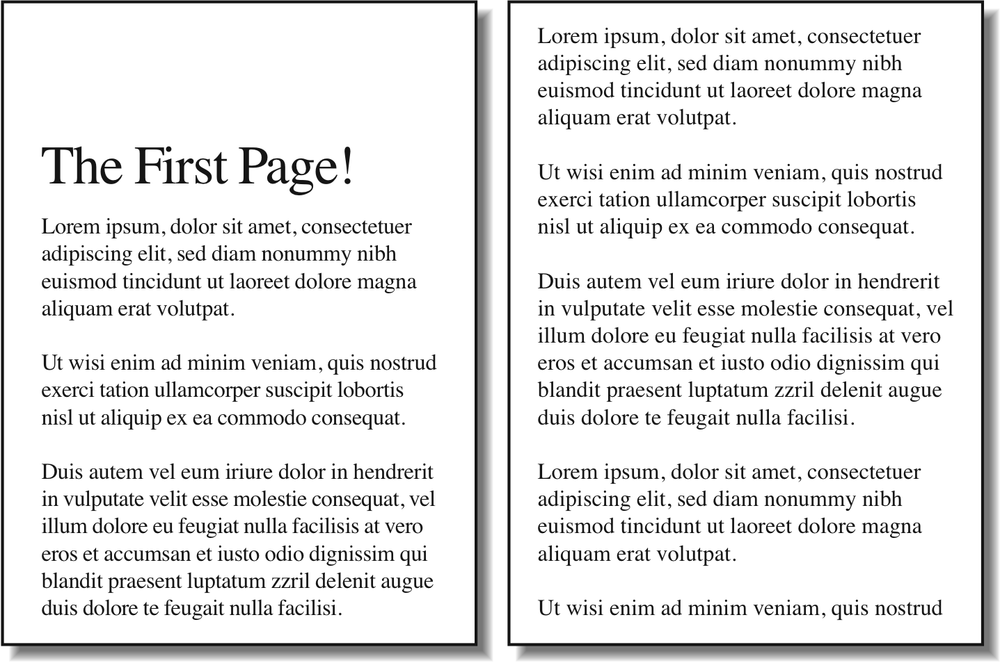
Figure 14-2. Specially styling the first page
In addition to styling the first page, you can also style left and
right pages, emulating the pages to the left and right of a book's spine. You can
style these differently using:leftand:right. For
example:
@page :left {margin-left: 3cm; margin-right: 5cm;}
@page :right {margin-left: 5cm; margin-right: 3cm;}
These
rules will have the effect of putting larger margins "between" the content of the
left and right pages, on the sides where the spine of a book would be. This is a
common practice when pages will be bound together into a book of some type. You
can see the result of the previous rules in
Figure 14-3
.
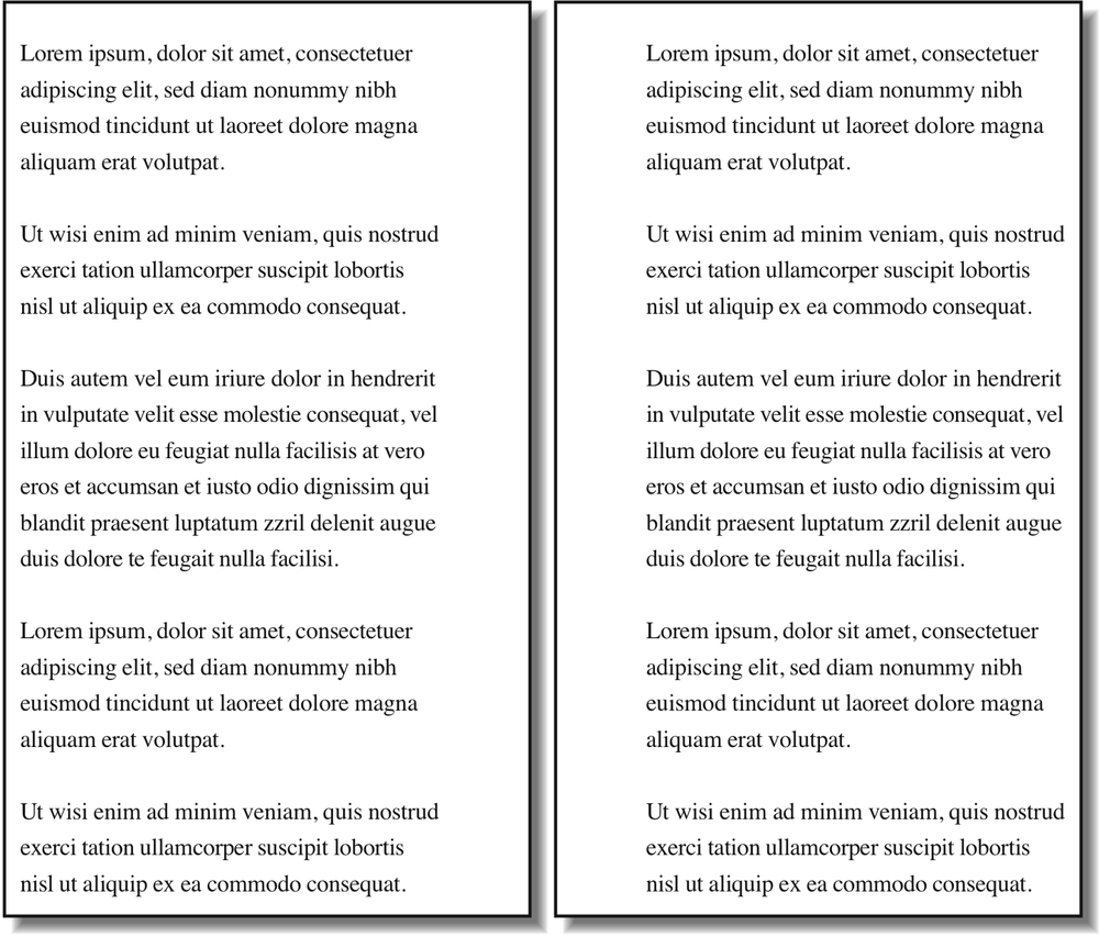
Figure 14-3. Styling left and right pages differently