CSS: The Definitive Guide, 3rd Edition (64 page)
Read CSS: The Definitive Guide, 3rd Edition Online
Authors: Eric A. Meyer
Tags: #COMPUTERS / Web / Page Design
elements
A very
common desire among authors of paged media is the ability to have a
running head
.
This is an element that appears on every page, such as
the document's title or the author's name. You can specify a running head in CSS2
by using a fixed-position element. For
example:
div#runhead {position: fixed; top: 0; right: 0;}
This
will place anydivwith anidofrunheadat
the top-right corner of every page box when the document is output to a paged
medium. The same rule would place the element in the top-right corner of the
viewport in a continuous medium, such as a web browser. Any element positioned in
this way will appear on every page. It is not possible to "copy" an element to
become a repeated element. Thus, given the following, theh1element will appear as a running head on every page, including
the first
one:
h1 {position: fixed; top: 0; width: 100%; text-align: center;
font-size: 80%; border-bottom: 1px solid gray;}
The
drawback is that theh1element, being
positioned on the first page, cannot be printed as anything except the running
head.
All of this talk about positioning elements in a paged medium leads to an
interesting question: what happens if an element is positioned outside the page
box? You don't even need positioning to create such a situation. Think about apreelement that contains a line with 411
characters. This is likely to be wider than any standard piece of paper, so the
element will be wider than the page box. What happens then?
As it turns out, CSS2 doesn't say exactly what user agents should do, so it's
up to them to come up with a solution. For a very widepreelement, the user agent might simply clip the element to the
page box and throw away the rest of the content. It could also generate extra
pages to display the "leftover" part of the element.
There are a few general recommendations for handling content outside the page
box, two of which are really important. First, content should be allowed to
protrude slightly from a page box to allow "bleeding." This implies that no extra
page would be generated for the portions of such content that exceed the page box.
Second, user agents are cautioned not to generate large numbers of empty pages
for the sole purpose of honoring positioning information. Consider:
h1 {position: absolute; top: 1500in;}
Assuming that the page boxes are 10 inches high, the user agent would have to
precede anh1with 150 page breaks (and thus
150 blank pages) just to honor that rule. Instead, a user agent might choose to
skip the blank pages and only output the last one, which actually contains theh1element.
The other two recommendations state that user agents should not position
elements in strange places just to avoid rendering them, and that content placed
outside a page box can be rendered in any number of ways. (Some elements of CSS
are useful and intriguing, but some seem to cheerily state the obvious.)
Aside from printed
pages, the other common paged medium is
projection
, which
describes information that's being projected onto a large screen, suitable for
viewing by a large crowd. Microsoft PowerPoint is one of the best-known
projection-medium editors today.
As of this writing, only one user agent supports projection-medium CSS: Opera for
Windows. This capability is called "OperaShow," and it allows authors to take any
HTML document and turn it into a slideshow. We'll look at the basics of this
capability, since it may appear in other user agents in the future, and it provides
an interesting view of how CSS can be used in media other than screen or print.
If you're breaking up a single document into a series of slides, you need a way
to define the boundaries between each slide. This is done using the page-break
properties. Whether you usepage-break-beforeorpage-break-afterwill depend largely on how
your document is constructed.
As an example, consider the HTML document shown in
Figure 14-8
. There is a series ofh2elements, each followed by an unordered
list. This forms the "outline view" for your slideshow.
Figure 14-8. A slideshow outline using simple HTML
Now all you need to do is break up the document into slides. Since every slide
starts with anh2element, you can simply
declare:
h2 {page-break-before: always;}
This will ensure that every page (that is, every slide) will start with anh2element. Since the title of each slide is
represented by anh2, this is fine: every slide
will have anh2as its first element. You can
see the rendering of a slide in
Figure
14-9
.
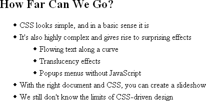
Figure 14-9. A slide
Of course, the slide looks pretty plain because you've done nothing else to
make it look good; you've simply defined where page breaks are to be inserted.
Given the outline as it's currently set up, you could also have defined slide
boundaries by inserting page breaks after the lists, instead of before theh2elements:
ul {page-break-after: always;}
This method would work well, as long as your outline never includes nested
lists. If there is a chance of having unordered lists nested within the
"top-level" lists, then you'd either need to go back to putting page breaks beforeh2elements, or add a second rule to prevent
page-breaking:
ul {page-break-after: always;}
ul ul {page-break-after: auto;}
elements
When you position elements, their initial
containing block will be the page box in which they are placed. Thus, if you want
the title of every slide to actually appear on the bottom of the slide, you would
write something
like:
h2 {page-break-before: always; position: absolute; bottom: 0; right: 0;}
This
rule would place anyh2element at the
bottom-right corner of the page box (slide) in which it appears. Of course, it's
possible to position elements with respect to other elements instead of the page
box. See
Chapter 10
for details on
positioning.
A fixed-position element, on the other hand, will appear
in every page box in the slideshow, just as in the print medium. This means that
you can take a single element, such as the document title, and put it on every
slide, like
this:
h1 {position: fixed; top: 0; right: 0; font-size: 80%;}
This
technique can be used to create running footers, graphical sidebars for every
slide, and so on.
It's often said that web designs should be flexible and able to adapt to any
resolution—and that's certainly true in most cases. However, projection styling is
not web styling, so it often makes sense for a projection style sheet to be
created with a specific resolution in mind. As an example, most projectors (as of
this writing) default to a resolution of 1024 × 768. If you know you'll be
projecting at that size, it's logical to set up your CSS for that exact size. Font
sizing, element placement, and so forth can all be tuned to create the best visual
experience for the target resolution.
For that matter, you might create different style sheets for different
resolutions: one for 800 × 600, another for 1024 × 768, and a third for 1280 ×
1024, just to cover the most common bases.
Figure 14-10
shows a slide at 1024 × 768.
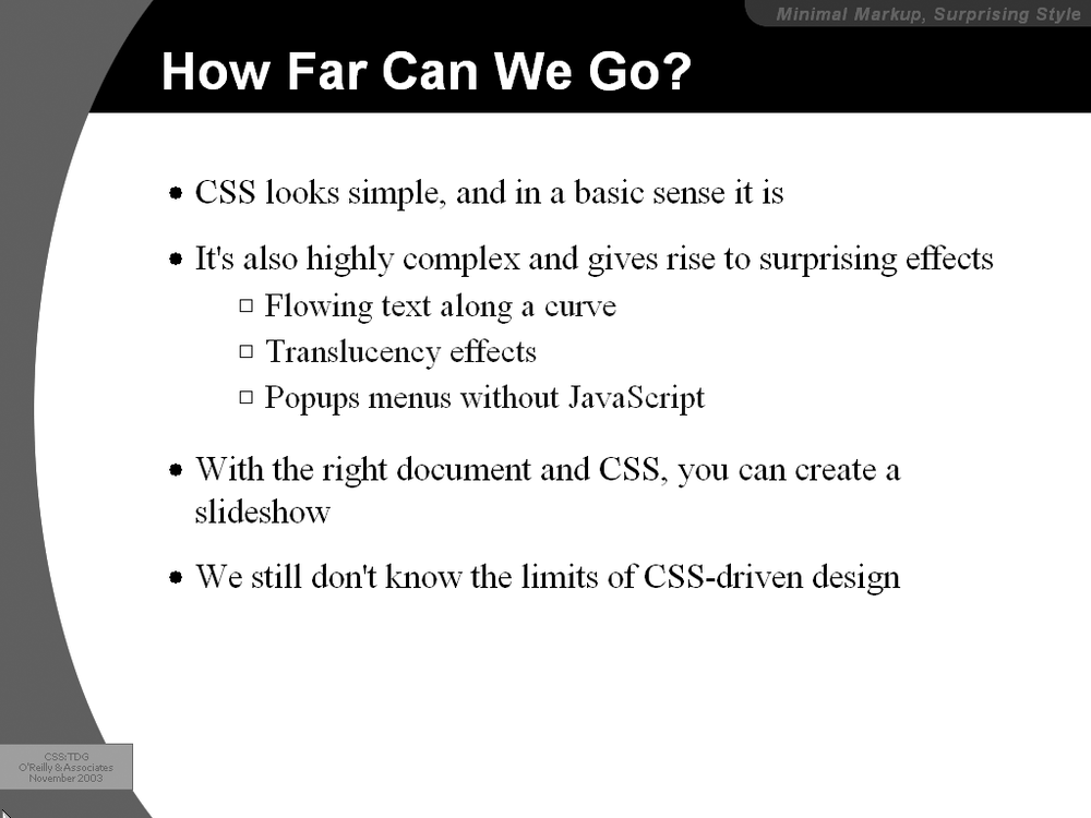
Figure 14-10. A fully styled slide
Another thing to bear in mind is that projected documents are generally more
readable for the audience if they employ high-contrast colors. This is
particularly true since some projector bulbs aren't as bright as others, and
dimmer bulbs call for even higher contrast. This also highlights (no pun intended)
the fact that you have even less of a guarantee of color fidelity in projection
situations than in normal web design (and that's not saying much).
Users who cannot see won't benefit from the visual styling
that most of CSS enables. For these users, what matters is not the drop shadows or
rounded corners, but the actual textual content of the page—which must be rendered
audibly if they are to understand it. The blind are not the only user demographic that
can benefit from aural rendering of web content. A user agent embedded in a car, for
example, might use aural styles
to enliven the
reading of web content such as driving directions, or even the driver's email.
To meet the needs of these users, CSS2 introduced a section describing aural styles.
As of this writing, there are two user agents that support, at least to some degree,
aural styles: Emacspeak
and Fonix
SpeakThis.
In spite of this, CSS2.1 effectively deprecates the media typeauraland all of the properties associated with it. The current
specification includes a note to the effect that future versions of CSS are likely to
use the media typespeechto represent spoken
renderings of documents, but it does not provide any details.
Due to this odd confluence of emerging implementation and deprecation, we will only
briefly look at the properties ofauralstyle sheets.
At the most basic level, you must determine
whether a given element's content should be rendered aurally at all. Inauralstyle sheets, this is handled with the propertyspeak.
speak
- Values:
normal|none|spell-out|inherit- Initial value:
normal- Applies to:
All elements
- Inherited:
Yes
- Computed value:
As specified
The default value,normal, is used to indicate
that an element's content should be spoken. If an element's content should not be
spoken for some reason, the valuenoneis used.
Even though an element's aural rendering may be suppressed usingnone, you may override the value on descendant elements,
which would thus be rendered. In the following example, the text "Navigation:" would
not be rendered aurally, but the text "Home" would be:
If an element and its descendants
must
be prevented from
rendering aurally, usedisplay:noneinstead. In this example, none of the content of
thedivwill be rendered aurally (or in any other
medium, for that matter):
The third value ofspeakisspell-out, which will most likely be used in conjunction
with acronyms or other content that should be spelled out. For example, the following
fragment of markup would be rendered aurally as T-E-D-S, or "tee eee dee ess":
TEDS
numbers
There are two other
properties that affect the way in which element content is rendered aurally. The
first affects the rendering of punctuation and is called (appropriately enough)speak-punctuation.
speak-punctuation
- Values:
code|none|inherit- Initial value:
none- Applies to:
All elements
- Inherited:
Yes
- Computed value:
As specified
Given the default value ofnone,
punctuation is rendered aurally as pauses of appropriate lengths, although CSS
does not define these lengths. To pick an example, the pause representing a period
(and thus the end of a sentence) might be twice as long as the pause representing
a comma. Pause lengths are likely to be language-dependent.
With the
valuecode, punctuation is actually rendered
aurally. Thus, the following example would be rendered as, "avast comma ye
scalawags exclamation
point":
Avast, ye scalawags!
To
use another example, the following fragment might be rendered aurally as, "a left
bracket href right bracket left curly brace color colon red semicolon right curly
brace":
a[href] {color: red;}
Similar
to affecting punctuation rendering,speak-numeraldefines the method of speaking
numbers.
The default valuecontinuousmeans that the number is spoken as a whole number, whereasdigitscauses numbers to be read
individually.
Consider:
23
23
speak-numeral
- Values:
digits|continuous|inherit- Initial value:
continuous- Applies to:
All elements
- Inherited:
Yes
- Computed value:
As specified
The aural rendering of the first paragraph would be "twenty-three,"
whereas the second paragraph would be rendered as "two three." As with
punctuation, numeric renderings are language-dependent but undefined.
headers
In the aural rendering of a table, it can be easy
to lose track of what the cell data actually means. If you're on the 9th row of a
12-row table, and the 6th cell in that row is "21.77," what are the odds you'll
remember what the 6th column represents? Will you even remember what the numbers
in this row relate to? Table headers provide this information and are easy to
check visually. To solve this problem in the aural medium, CSS2 introducedspeak-header.
speak-header
- Values:
once|always|inherit- Initial value:
once- Applies to:
Elements containing table header information
- Inherited:
Yes
- Computed value:
As specified
By default, a user agent will render the content of a table header
only once, when the cell is encountered. The other alternative is to always render
the table header information when a cell relating to that header is
rendered.
Let's consider the following simple table as an
example:
| Jim | Joe | Jane | |
|---|---|---|---|
| red | green | blue |
Without
any styles applied, the aural rendering of this table would be, "Favorite Color
Jim Joe Jane red green blue." You can probably figure out what all that means, but
imagine a table containing the favorite colors of 10 or 20 people. Now, suppose
you apply the following styles to this
table:
#colors {speak-header: always;}
#headers {speak: none;}
The
aural rendering of the table should then be, "Favorite Color Jim red Joe green
Jane blue." This is much easier to understand, and it will continue to be—no
matter how large the table might grow.
Note that the document language itself defines the method of determining an
element's role as a table header. Markup languages may also have ways to
associate header information with elements or groups of elements—for example,
the attributesscopeandaxisin HTML4.
rate
In addition to ways to affect the style of speech, CSS
also offersspeech-rate, which is used to set
the speed at which content is aurally rendered.
speech-rate
- Values:
| x-slow|slow|medium|fast|x-fast|faster|slower|inherit- Initial value:
medium- Applies to:
All elements
- Inherited:
Yes
- Computed value:
An absolute number
The values are defined as follows:
Specifies the speaking rate in words per minute. This is likely to
vary by language, since some languages are spoken more quickly than
others.x-slowEquivalent to 80 words per minute.
slowEquivalent to 120 words per minute.
mediumEquivalent to 180–200 words per minute.
fastEquivalent to 300 words per minute.
x-fastEquivalent to 500 words per minute.
fasterIncreases the current speech rate by 40 words per minute.
slowerDecreases the current speech rate by 40 words per minute.
Here are two examples of extreme changes in speech
rate:
*.duh {speech-rate: x-slow;}
div#disclaimer {speech-rate: x-fast;}
CSS
does not define how the speech rate is altered. A user agent could draw out each
word, stretch out the pauses between words, or both.
In an aural
medium, one of the most important aspects of presentation is the volume of the sound
produced by the user agent. Enter the aptly named property,volume.
volume
- Values:
| | silent|x-soft|soft|medium|loud|x-loud|inherit- Initial value:
medium- Applies to:
All elements
- Inherited:
Yes
- Computed value:
An absolute number
The values are defined as follows:
Provides a numeric representation of the volume.
0corresponds to the minimum audible volume, which is
not
the same as being silent;100corresponds to the maximum comfortable
volume.Calculated as a percentage of the inherited value.
silentNo sound is produced, which is different from the numeric value
0. This is the aural equivalent ofvisibility: hidden.x-softEquivalent to the numeric value
0.softEquivalent to the numeric value
25.mediumEquivalent to the numeric value
50.loudEquivalent to the numeric value
75.x-loudEquivalent to the numeric value
100.
It's important to note that thevolumevalue
(say that five times fast!) defines the
median
volume, not the
precise volume of every sound produced. Thus, the content of an element withvolume:50;may well
be rendered with sounds that go above and below that level, especially if the voice
is highly inflected or has a dynamic range of sounds.
The numeric range is likely to be user-configured, since only an individual user
can determine his minimum audible volume level (0)
and maximum comfortable volume level (100). As an
example, a user might decide that the minimum audible volume is a 34dB tone, and the
maximum comfortable volume is an 84dB tone. This means there is a 50dB range between0and100,
and each increase of one in the value will mean a half-dB increase in the median
volume. In other words,volume:soft;would translate to a median volume of 46.5dB.
Percentage values have an effect analogous to their effect infont-size: they increase or decrease the value based on
the parent element's value. For example:
div.marine {volume: 60;}
big {volume: 125%;}

When I say jump, I mean rabbit, you maggots!
Given the audio range described before, the content of thedivelement here would be spoken with a median volume of
64dB. The exception is thebigelement, which is125%of the parent's value of60. This calculates to75, which is equivalent to 71.5dB.
If a percentage value would place an element's computed numeric value outside the
range of0through100, the value is clipped to the nearest value. Suppose you were to change
the previous styles to read:
div.marine {volume: 60;}
big {volume: 200%;}
This would cause thebigelement'svolumevalue to be computed as120; that value would then be clipped to100, which corresponds here to a median volume of 84dB.
The advantage of defining volume in this way is that it permits the same style
sheet to serve in different environments. For example, the settings for0and100will be
different in a library than they will be in a car, but the values will effectively
correspond to the same intended auditory effects in each setting.