CSS: The Definitive Guide, 3rd Edition (60 page)
Read CSS: The Definitive Guide, 3rd Edition Online
Authors: Eric A. Meyer
Tags: #COMPUTERS / Web / Page Design
Another important part of the user interface is the
cursor (referred to in the CSS specification as the "pointing device"),
which is controlled by a device such as a mouse,
trackpad, graphic tablet, or even an optical-reading system. The cursor is useful for
providing interaction feedback in most web browsers; an obvious example is that the
cursor changes to a small hand with an extended index finger whenever it crosses over a
hyperlink.
CSS2 lets you change the cursor icon, which means that it's much easier to create
web-based applications that function in a manner similar to desktop applications in
the operating system. For example, a link to help files might cause the cursor to
turn into a "help" icon such as a question mark, as shown in
Figure 13-2
.
Figure 13-2. Changing the cursor's icon
This is accomplished with the propertycursor.
cursor
- Values:
[[
,]* [ auto|default|pointer|crosshair|move|e-resize|ne-resize|nw-resize|n-resize|se-resize|sw-resize|s-resize|w-resize|text|wait|help|progress]] |inherit- Initial value:
auto- Applies to:
All elements
- Inherited:
Yes
- Computed value:
For
values, an absolute value; otherwise, as
specified
The default value,auto, simply means that the
user agent should determine the cursor icon that is most appropriate for the current
context. This is not the same asdefault, which
forces the icon to be the operating system's default cursor. The default cursor is
usually an arrow, but it does not have to be; it depends on the current computing
environment.
cursors
The valuepointerchanges the cursor icon to be the same as when the user moves the cursor over a
hyperlink. You can even describe this behavior for HTML
documents:
a[href] {cursor: pointer;}
Withcursor, any element can be defined to change
the icon as though it were a link. This can be very confusing to the user, so I
don't recommend doing it often. On the other hand (so to speak),cursormakes it much easier to create interactive,
script-driven screen widgets out of non-link elements and then change the icon
appropriately, as illustrated by
Figure
13-3
.
Figure 13-3. Indicating an element's interactivity
Internet Explorer for Windows before IE6 did not recognizepointer, but instead used the valuehandto invoke the "pointing hand" icon. IE6
recognizes both values. A common recommendation is to use both values in
succession, like this:
#example {cursor: pointer; cursor: hand;}
This will not validate, but it will get a consistent result in newer
browsers and older versions of Explorer. Note that the order is critical: you
cannot reverse the values and expect this to work. See
http://developer.mozilla.org/en/docs/Giving_'cursor'_a_Hand
for more
details.
The other cursor icon very common to web browsing is thetexticon, which appears in situations where the user
is able to select text. This is typically an "I-bar" icon, and serves as a visual
cue that the user can drag-select the content under the cursor.
Figure 13-4
shows a text icon at the end
of some already selected text.
Figure 13-4. Selectable text and the text cursor
Another way to indicate interactivity is to use the valuecrosshair, which changes the cursor icon into, well,
a crosshair symbol. This is typically a pair of short lines at a 90-degree angle
to each other, one vertical and the other horizontal, looking rather like a plus
(+) sign. However, a crosshair could also
resemble a multiplication sign (or a lowercase "x") or even an icon similar to the
display inside a rifle scope. Crosshairs are usually used with screen-capture
programs, and they can be useful in situations where the user is expected to know
exactly which pixel is being clicked.
cursors
In many circumstances, the
valuemovewill yield a result similar tocrosshair.moveis used in situations where the author needs to indicate that a
screen element can be moved, and it is often rendered like a thick crosshair with
arrowheads on the ends of the lines. It may also be rendered as a "gripping hand"
whose fingers curl when the user clicks and holds the mouse button. Two possiblemoverenderings are shown in
Figure 13-5
.

Figure 13-5. Differing icons for move
Then there are the variouscursorvalues related tomove:e-resize,ne-resize, and so on. Windows and most graphical Unix-shell users will
recognize these as the icons that appear when the mouse cursor is placed over the
side or corner edges of a window. For example, placing the cursor over the right
side of the window will bring up ane-resizecursor, indicating that the user can drag the right side of the window back and
forth to change the window size. Putting the cursor over the lower-left corner
invokes thesw-resizecursor icon. There are
many different ways to render these icons;
Figure 13-6
shows a few of the possibilities.
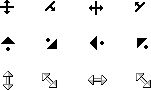
Figure 13-6. A selection of "resize" cursors
Bothwaitandprogressindicate that the program is busy. However, they're not
identical:waitmeans the user should wait
until the program isn't as busy, whileprogressindicates that the user should feel free to continue interacting with the program,
even though it's busy. On most operating systems,waitis either a watch (possibly with spinning hands) or an hourglass
(possibly turning itself over every so often).progressis typically represented as a spinning "beach ball" or an
arrow with a small hourglass off to one side.
Figure 13-7
shows some of these icons.

Figure 13-7. Waiting versus progressing
The valueprogresswas introduced in
CSS2.1.
help
In situations where the
author wants to indicate that the user can get some form of help, the valuehelpis the answer. Two very common
renderings ofhelpare a question mark and an
arrow with a small question mark next to it.helpcan be very useful if you have classed certain links that point to
more information or to information that will help the user understand the web page
better. For
example:
a.help {cursor: help;}
You
can also usehelpto indicate that an element
has "extra" information, such asacronymelements withtitleattributes. In many user
agents, leaving the cursor over a titled acronym will cause the user agent to show
the contents of thetitleattribute in a "tool
tip." However, users who move the cursor around quickly, or who have slow
computers, may not realize the extra information is there if the cursor didn't
change. For such users, the following rule could be useful, and will lead to a
result like that shown in
Figure
13-8
:
acronym[title] {cursor: help; border-bottom: 1px dotted gray;}

Figure 13-8. Showing that help (in the form of more information) is available