Data Mining (135 page)
Authors: Mehmed Kantardzic
15.3 PARALLEL COORDINATES
Geometric-projection techniques include the parallel coordinate—visualization technique, one of the most frequently used modern visualization tools. The basic idea is to map the k-dimensional space onto the two-display dimensions by using k equidistant axes parallel to one of the display axes. The axes correspond to the dimensions and are linearly scaled from the minimum to the maximum value of the corresponding dimension. Each data item is presented as a polygonal line, intersecting each of the axes at the point that corresponds to the value of the considered dimension.
Suppose that a set of 6-D samples, given in Table
15.1
, is a small relational database. To visualize these data, it is necessary to determine the maximum and minimum values for each dimension. If we accept that these values are determined automatically based on a stored database, then graphical representation of data is given on Figure
15.5
.
TABLE 15.1.
Database with Six Numeric Attributes
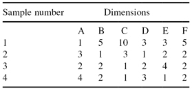
Figure 15.5.
Graphical representation of 6-dimesional samples from the database given in Table
15.1
using a parallel coordinate visualization technique.

The
anchored-visualization perspective
focuses on displaying data with an arbitrary number of dimensions, for example, between four and 20, using and combining multidimensional-visualization techniques such as weighted Parabox, bubble plots, and parallel coordinates. These methods handle both continuous and categorical data. The reason for combining them involves their relative strengths. Box plots works well for showing distribution summaries. Parallel coordinates’ strength is their ability to display high-dimensional outliers, individual cases with exceptional values. Bubble plots are used for categorical data and the size of the circles inside the bubbles shows the number of samples and their respective value. The dimensions are organized along a series of parallel axes, as with parallel-coordinate plots. Lines are drawn between the bubble and the box plots connecting the dimensions of each available sample. Combining these techniques results in a visual component that excels the visual representations created using separate methodologies.
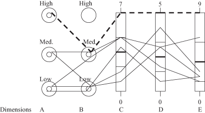
An example of multidimensional anchored visualization, based on a simple and small data set, is given in Table
15.2
. The total number of dimensions is five, two of them are categorical and three are numeric. Categorical dimensions are represented by bubble plots (one bubble for every value) and numeric dimensions by boxes. The circle inside the bubbles visually shows the percentage that the given value represents in a database. Lines inside the boxes represent mean value and standard deviation for a given numeric dimension. The resulting representation in Figure
15.6
shows all six 5-D samples as connecting lines. Although the database given in Table
15.2
is small, still, by using anchored representation, we can see that one sample is an outlier for both numeric and categorical dimensions.
TABLE 15.2.
The Database for Visualization
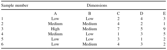
Figure 15.6.
Parabox visualization of a database given in Table
15.2
.
The circular-coordinates
method is a simple variation of parallel coordinates, in which the axes radiate from the center of a circle and extend to the perimeter. The line segments are longer on the outer part of the circle where higher data values are typically mapped, whereas inner-dimensional values toward the center of the circle are more cluttered. This visualization is actually a star and glyphs visualization of the data superimposed on one another. Because of the asymmetry of lower (inner) data values from higher ones, certain patterns may be easier to detect with this visualization.
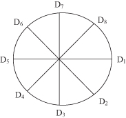
15.4 RADIAL VISUALIZATION
Radial visualization is a technique for representation of multidimensional data where the number of dimensions are significantly greater then three. Data dimensions are laid out as points equally spaced around the perimeter of a circle. For example, in the case of an 8-D space, the distribution of dimensions will be given as in Figure
15.7
.
Figure 15.7.
Radial visualization for an 8-dimensional space.
A model of springs is used for point representation. One end of n springs (one spring for each of n dimensions) is attached to n perimeter points. The other end of the springs is attached to a data point. Spring constants can be used to represent values of dimensions for a given point. The spring constant K
i
equals the value of the
i
th coordinate of the given n-dimensional point where i = 1, … , n. Values for all dimensions are normalized to the interval between 0 and 1. Each data point is then displayed in 2-D under condition that the sum of the spring forces is equal to 0. The radial visualization of a 4-D point P(K
1
, K
2
, K
3
, K
4
) with the corresponding spring force is given in Figure
15.8
.
Figure 15.8.
Sum of the spring forces for the given point P is equal to 0.

Using basic laws from physics, we can establish a relation between coordinates in an n-dimensional space and in 2-D presentation. For our example of 4-D representation given in Figure
15.8
, point P is under the influence of four forces, F
1
, F
2
, F
3
, and F
4
. Knowing that every one of these forces can be expressed as a product of a spring constant and a distance, or in a vector form

it is possible to calculate this force for a given point. For example, force F
1
in Figure
15.8
is a product of a spring constant K
1
and a distance vector between points P(x, y) and D
1
(1,0):

The same analysis will give expressions for F
2
, F
3
, and F
4
. Using the basic relation between forces