Windows 10 Revealed (11 page)
Read Windows 10 Revealed Online
Authors: Kinnary Jangla
Tags: #Computers, #Operating Systems, #Windows Desktop, #Hardware, #Personal Computers, #PCs
Table
4-1
provides a summary of this chapter.
Table 4-1.
Chapter Summary
Problem | Figures |
|---|---|
How to tell whether it is a universal app or not | 4-1 to 4-2 |
Mail and Calendar apps | 4-3 to 4-15 |
Photos app | 4-16 to 4-19 |
Music and Videos apps | N/A |
Microsoft Office apps | N/A |
Note
I use Windows 10 tablet screenshots throughout this chapter. As the definition of universal apps holds, all of these apps look the same on all Windows 10 devices.
How to Tell Whether It Is a Universal App or Not
There is a neat little icon to identify universal apps; it looks like a computer and a phone overlapping each other. This icon represents the sharing experience, which is unifying across devices. When you search for an app in Windows Store, the app snippet shows you the icon to determine whether it is a universal app or not, as seen in Figure
4-1
.
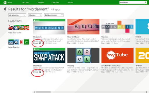
Figure 4-1.
Universal apps have the icon of a computer and a phone
Furthermore, when you select the app, Figure
4-2
shows that you can see the icon on the following screen. The icon is clearly seen in Figure
4-3
.
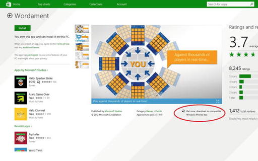
Figure 4-2.
The icon identifies a universal app
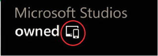
Figure 4-3.
The universal app icon (a phone overlapping a computer)
Mail and Calendar Apps
The new Mail app brings all of your e-mail accounts into one place, similar to what the desktop mail client has been doing. Of course, this is different than the current “link inboxes” function in Windows Phone 8.1. This new Mail app is universal and behaves in the same way across devices.
Upon opening the Mail app, you are welcomed with a clean-looking screen, like the one seen in Figure
4-4
.
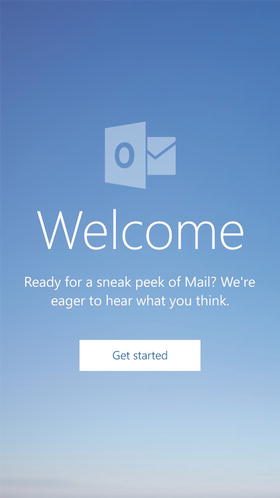
Figure 4-4.
The Welcome screen of the Mail app
The
Get started
button takes you to the account screen that you already have on your phone, or the
Add account
screen, where you can add an account, as seen in Figure
4-5
.
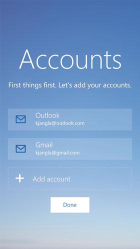
Figure 4-5.
The “Add account” screen on the Mail app
Once you are inside the account, the screen looks really clean and the features are very intuitive. The compose mail button is in the top-right, alongside the refresh and the search buttons (see Figure
4-6
).
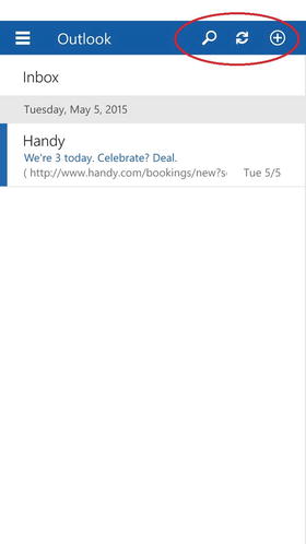
Figure 4-6.
The compose mail, refresh, and search buttons are all on the top right
Going to the left side of the screen, and selecting the hamburger menu takes you to the Inbox, Drafts, and Sent Items (see Figure
4-7
).
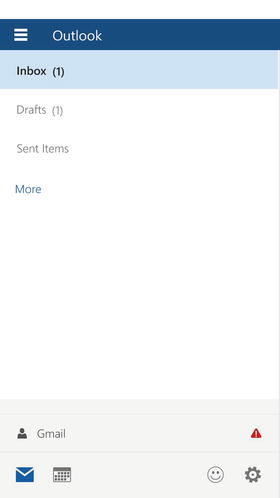
Figure 4-7.
Selecting the hamburger menu icon takes you the list of folders in your Inbox
Deleting and flagging e-mails is super simple. A right swipe deletes an e-mail and a left swipe flags the e-mail. You don’t need to go to a menu anymore to find these features (see Figures
4-8
and
4-9
).
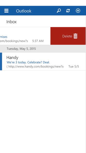
Figure 4-8.
A right swipe deletes an e-mail
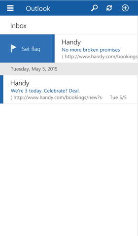
Figure 4-9.
A left swipe flags an e-mail
To clear the flag, swipe left on the flagged e-mail (see Figure
4-10
).
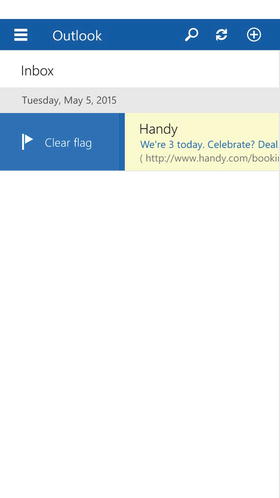
Figure 4-10.
Clear the flag on a previously flagged e-mail