Windows 10 Revealed (12 page)
Read Windows 10 Revealed Online
Authors: Kinnary Jangla
Tags: #Computers, #Operating Systems, #Windows Desktop, #Hardware, #Personal Computers, #PCs
To get to the Calendar app, you can either access it from your Mail app or from the app list. From your Mail app, select the hamburger menu icon on the left side of the screen. You will see the Calendar icon on the bottom. Figures
4-11
and
4-12
show how to locate the Calendar app from the Mail app.

Figure 4-11.
Select the icon on the top left of the screen
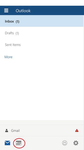
Figure 4-12.
The Calendar icon at the bottom of the screen
Another way to go to the Calendar app is to find it in your app list. The app is called Outlook Calendar (see Figure
4-13
).
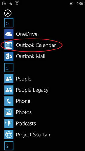
Figure 4-13.
Open the Calendar app from the app list
As with the Mail app, the Calendar app welcomes you with a Welcome screen. After hitting the
Get started
button, if you’ve already added your account, you are presented with the new design of the Calendar (see Figure
4-14
). Here you will find the current week laid out in Calendar view, with your appointments for the day underneath.
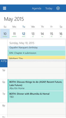
Figure 4-14.
The Day view design of the Calendar app. The Agenda, Today and Create an Event tabs are on the top of the screen
At the top you have three buttons that change back and forth from the Agenda view and Day view. One takes you to today’s date, and the other to create a new event.
Again, in the top-left corner, you have the hamburger menu. There you get a panel that allows you to turn off and on the various calendars you have for each account. You also have the feedback and settings buttons at the bottom of the Mail app (see Figure
4-15
).
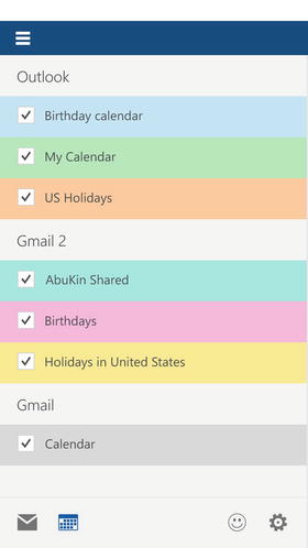
Figure 4-15.
The hamburger menu has a panel that allows you to choose which calendars you want on or off
Finally, the dates slider shows you extra the all the days of the month (see Figure
4-16
).
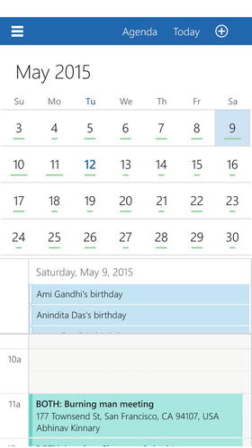
Figure 4-16.
A gentle top or bottom swipe on the dates slider shows you all the days of the month
Photos App
The Organization feature in the Photos app is one of my favorite features. The Photos app aggregates all of your photos on your device and those on OneDrive, and offers a Collection view that sorts out any photos that may have been taken during burst mode, in this era of selfies. Also, you can choose to let the app create autogenerated photo albums or you can create your own. The visual effect is extremely attractive. The Collection view arranges the photos according to the dates on which they were taken. Figure
4-17
shows this feature.
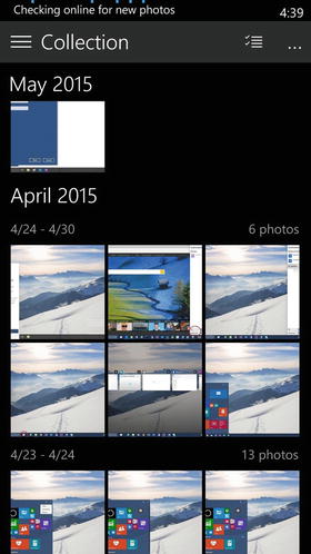
Figure 4-17.
The Collection view separates photos according to the dates that they were taken
The Albums view automatically creates albums for you. Figure
4-18
shows the Albums view.

Figure 4-18.
This is a placeholder screenshot
The hamburger menu in the top-left corner of the Photos app provides a panel where you can choose which view you want to see your photos in (see Figure
4-19
).
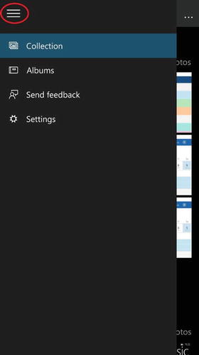
Figure 4-19.
The hamburger menu gives you the Collection and Album view options along with Feedback and Settings
There is an Enhance button on the bottom of each photo; it enhances the colors and the overall quality of the picture, allowing you to remove red eye and brighten dark photos with just one button. Figure
4-20
shows the enhance button. You can also crop a photo pretty easily. Note the Crop button at the bottom of Figure
4-20
.
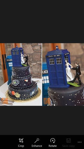
Figure 4-20.
The Crop, Enhance, and Rotate buttons beneath the photo
One of my favorite things about this app is that the presentation is similar on both the Desktop mode and the Mobile mode, indicating Microsoft’s attempt to truly offer a universal photo app experience.
Music and Videos Apps
The new universal Music app has cooler features, but no longer has the Xbox naming convention. Although the Music app is very similar to the previous version, it has some modifications that makes its usage more efficient. You can now drag and drop songs into your Music app from across devices, and play songs from your OneDrive. You can also make playlists by dragging and dropping songs from different devices. There is better support to browse and buy music from the Windows Store. You can also shuffle, filter, and sort through songs from different artists. Overall, the new Music app has a much better, cleaner, and more elegant design (with a dark color scheme), as well as easier navigation and better accessibility.